Showing posts with label V/S. Show all posts

Thursday, December 29, 2011

Asus Eee Pad Transformer Prime vs LG Optimus Pad


The tablet market is awash with quality devices, all vying to end up in your shopping bag this sales season, but which tablet will give you the most for your money?

Do you choose power before portability? Should you opt for a device with expandable memory? Or should you just cast all research aside and just choose the biggest, fastest, most expensive device on the market?

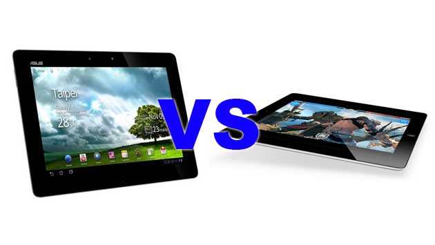
Well, we're here to help you wade through the myriad statistics on offer, as we take the latest, greatest tablet from Asus, the Eee Pad Transformer Prime, and weigh it up against one of last year's surprise packages, the LG Optimus Pad.

Display

Asus' Eee Pad Transformer Prime is kitted out with a stunning 10.1-inch Super IPS+ LCD display that is super responsive and glorious to behold.

The screen operates at 1280 x 800 and features a pixel density of 149PPI, which is more than enough to provide some of the crispest visuals around.

The LG Optimus Pad offers up an 8.9-inch LCD touchscreen that holds its own against the mighty Transformer Prime, with a resolution of 768 x 1280 and a thoroughly impressive pixel density of 168PPI.

The extra clarity is certainly not to be sniffed at, but we aren't sure it's enough to make us turn our backs on an inch more screen space and the deeper colours of the Asus.

Winner - Asus Eee Pad Transformer Prime

Power

LG's Optimus Pad is powered by nVidia's Tegra 2 chipset, with the dual-core CPU clocked at 1GHz. The perennially reliable ULP GeForce GPU takes care of the visuals, and makes gaming an enjoyable experience on the device.

The Optimus Pad also boasts 1GB RAM and 32GB of on-board storage, but offers no support for removable memory.

Asus' Eee Pad Transformer Prime has yet to be bested in this round though, and it's easy to see why when you take a look at its spec sheet: 1.3GHz quad-core CPU, ULP GeForce GPU, 1GB RAM, 32 or 64GB of storage and support for Micro SD cards up to 32GB capacity.

There really isn't a tablet to touch the Transformer Prime when it comes to horsepower and we expect it will remain that way for a while yet. So if power's what you're looking for you've found the device for you.

Winner - Asus Eee Pad Transformer Prime

Software


Both of these tablets are powered by Google's Android OS, specifically version 3.0+, otherwise known as Honeycomb, which was tailored for tablet use.

LG's Optimus Pad ships with version 3.0 of the software, while the Asus Eee Pad Transformer Prime leaves the factory fitted with version 3.2, which offers support for visually improving apps on larger devices and the odd bugfix thrown in for good measure.

Honeycomb itself is a fast, fun affair, with plenty of apps available, a new, richly designed UI and some neat notification tweaks, as well as updated core applications. It's eminently customisable, offers full flash browsing and largely does anything your netbook can do equally as well (with the help of the right app, naturally).

There a few idiosyncrasies that prevent Honeycomb from keeping up with Apple's iOS though. For example, the lack of Android 3+ applications is hugely detrimental, and you'll also have to contend with the odd crash, which is something we didn't enjoy, but overall it's a decent platform that will continue to improve.

Winner - Draw


Form & Build

Asus Eee Pad Transformer Prime - 263 x 180.8 x 8.3mm, 586g
LG Optimus Pad - 243.8 x 150 x 12.7 mm, 621g

There's no denying that both of our contenders here are well built. They feel solid, balanced in the hand and reassuringly heavy, without being overly cumbersome.

The Asus Eee Pad Transformer Prime is arguably the better looking of the two, and at nearly 4mm thinner than the Optimus Pad it's definitely the more comfortable to use, and also the more portable, but the LG's effort is by no means big or unpleasant to look at.

One aspect that we like about both tablets is that they feel, and largely are, durable. There's nothing worse than holding a shiny, expensive device and worrying about it hitting the floor with a smash, but both of these devices give off the 'we can take it' vibe that will make you want to pick them up and play with them (NOTE - We aren't saying that they'll take being bounced on your floor, so don't try!).

Winner - Asus Eee Pad Transformer Prime

Camera


The Asus Eee Pad Transformer Prime features the very best camera that we've seen on a tablet to date.

The 8-megapixel primary shooter, which offers geo-tagging, autofocus, LED flash and 1080P video capture, is a great performer which is fully capable of capturing print-worthy images in good light and captured video is of a generally high standard too.

The device's secondary 1.2-megapixel camera is perfect for video chatting and rounds off some very nice photographic capabilities.

The LG Optimus Pad features dual 5-megapixel primary cameras capable of capturing stereoscopic (3D) images and also offers an LED flash, geo-tagging, autofocus and 1080 2D video capture, and 720P in 3D.

LG's contender also has a nice 2-megapixel secondary camera which is great for video calling.

While it's a great performer, the general standard of still images is significantly lower than that of the Transformer Prime, and all the bells and whistles can't make up for a good, standard snapshot, which is largely all a tablet is going to be used for.

Winner - Asus Eee Pad Transformer Prime

As we've come to expect, Asus' Eee Pad Transformer Prime has blown another contender out of the water!

We're fast running out of superlatives to describe this little box of tricks. It's as powerful as a netbook, as portable as a notepad and has all the top-tier features of a high-end smartphone; there really isn't anything on the market to touch it, save for Apple's iPad 2.

LG's Optimus Pad is a nice enough device, but it doesn't excel in any single area, while the Transformer Prime excels at nearly everything.

Put simply, if you're in the market for a tablet you should either buy the Asus Eee Pad Transformer Prime or the Apple iPad 2; and that only holds its own against Asus' device thanks to its killer OS!

Friday, December 23, 2011

Samsung Galaxy Nexus vs Nokia Lumia 800

We compare Samsung's flagship Android Ice Cream Sandwich phone, the Galaxy Nexus, against Nokia's premier Windows Phone 'Mango' handset, the Lumia 800.

Form
Samsung Galaxy Nexus - 135.5x67.9x8.9mm,135g
Nokia Lumia 800 - 116.5x61.2x12.1mm,142g
Visually both devices are very impressive with some distinctive and unique design features which help them stand out from the competition.
The Nokia Lumia 800 is a very sharp and angular handset being bluntly rectangular in shape and topped by a gently curved glass screen.
Build quality feels very impressive indeed, the phone uses an aluminium unibody and it’s probably one of the most well put-together handsets we’ve seen this year.
Samsung’s Galaxy Nexus is the polar opposite in terms of aesthetics, it’s all curves but it isn’t over-the-top – being a larger phone overall the longer lines compliment the slight curvature at either end of the device quite nicely.
Sadly, the Galaxy Nexus doesn’t feel quite so solid construction-wise as its opponent.
We have to give this round to the Nokia Lumia 800.
Winner – Nokia Lumia 800
Display
Nokia’s Lumia 800 has a relatively small display at 3.7-inches but it makes up for this with incredibly sharp picture quality thanks to the use of a Samsung AMOLED screen and Nokia’s own ClearBlack technology.
It features multi-touch support and reinforced Gorilla Glass, while the 480x800 pixel resolution grants a pixel density clocking in at 252 pixels-per-inch (ppi).
It’s one of the best displays on a Windows Phone we’ve seen to date, the screen is bright and crystal clear with vivid colours which really pop out at you.
The Galaxy Nexus uses Samsung’s own Super AMOLED technology, which is slightly better than the Nokia’s ‘vanilla’ AMOLED and it’s a pretty big slate of glass at 4.65-inches.
Despite its large size, Samsung has managed to keep the pixel density very high indeed, a 720x1280 pixel resolution results in 316ppi.
Multi-touch is again supported and an oleophobic coating protects the screen from oily fingerprints.
Both displays are pretty amazing to behold and each manufacturer has clearly lavished a lot of effort and attention on these screens.
At the end of the day, however, the Samsung Galaxy Nexus goes that extra mile, not only is it a substantially sized display, making media easier and more satisfying to view, but it achieves this without compromising on picture quality and goes so far as to offer some of the best available. It’s very impressive stuff indeed.
Winner – Samsung Galaxy Nexus

Storage
Samsung’s flagship Android Ice Cream Sandwich phone has two options for storage, with choices of either 16GB or 32GB onboard. Processing power is supplemented by 1GB of RAM.
The Nokia Lumia 800 only has the 16GB option for internal capacity which, while ample, is half the top-end offered by Samsung’s device. It’s also slightly behind on the RAM side of things with around half the memory of the Galaxy Nexus at 512MB.
Neither smartphone is fitted with a card slot, meaning there’s no option to expand storage space with microSD.
Samsung’s Galaxy Nexus wins this round by doubling up on the Lumia 800’s offerings.
Winner – Samsung Galaxy Nexus

Processor
Discussing the processors between Android and Windows Phones is a tricky thing, because you invariably run up against the issue of how the two platforms work in relation to optimisation.
However, the Galaxy Nexus is a little different from most other Android phones.
The problem with Android normally is it’s a one size fits all system which isn’t optimised very well, but this isn’t an issue on the Galaxy Nexus because, as it’s the Android Ice Cream Sandwich flagship device Samsung has worked closely with Google to get everything as finely tuned as possible.
The Galaxy Nexus uses a dual core ARM Cortex-A9 processor clocked at 1.2GHz and running the Texas Instruments OMAP 4460 chipset alongside a PowerVR SGX540 graphics processing unit (GPU).
Performance on this setup is going to be something pretty special, especially with the extra optimisation and tuning.
Nokia’s Lumia 800 runs on single core hardware but again it’s been well optimised and offers really good performance from its 1.4GHz Qualcomm Scorpion processor running the MSM8255 Snapdragon chipset and an Adreno 205 GPU.
Both offer excellent performance in terms of typical smartphone tasks and navigating their respective interfaces.
However, the Galaxy Nexus will handle high-end apps and games with demanding graphics much more capably and will remain the more competitive option looking ahead to the future.
Winner – Samsung Galaxy Nexus


Operating System
Microsoft’s Windows Phone ‘Mango’ platform, which the Nokia Lumia 800 runs, is a refreshing and innovative system to use.
It completely shuns the conventional ‘desktop’ style homescreens populated by app shortcuts found on Android, iOS and BlackBerry OS.
Instead, it opts for a continuous scrolling interface populated by ‘Live Tiles’ which push useful app information to the surface, rather like miniaturised widgets.
Social networking integration and the merging of communication methods (including email, text, instant messaging and calls) is excellent on Windows Phone, there is currently no other platform which gets you connected so easily.
It’s not perfect, however, for a start there is a severe lack of apps comparative to Android and iOS and many apps which are free on these other platforms come with a price tag on Windows Phone.
Windows Phone also doesn’t feature true multi-tasking but rather a substitute which, while better than nothing, can at times be frustrating.
Essentially, apps are put into hibernation in the background but do not continue to function.
Switching between them is commendably easy but unlike competing platforms you cannot, for example, put a social networking app to sleep and expect it to update.
This doesn’t affect the integrated feed from the People Hub, but sometimes you might want more direct control through an official app and it’s annoying that they cannot perform any background tasks.
Android’s multi-tasking remains unsurpassed, the system handles multiple running programs with ease and the intuitive quick-switching menu has made the jump from the tablet-only Honeycomb build. You can also swipe apps away with gestures, which is nice.
In many other ways Ice Cream Sandwich seems like it’s simply playing catch-up with its tablet-only predecessor, Honeycomb, and Apple’s iOS.
It’s a decent system but it’s not the exceptional revolution many were waiting for.
Everything has been given a facelift and the interface is reasonably intuitive – things are where you expect them to be.
While Windows Phone looks nice and feels different it could have been a much more customisable platform, generally speaking, while we loved the social networking integration for a heightened sense of being ‘plugged in’ to our social circles, most other areas left us wanting and, frankly, made us miss Android and iOS.
Winner – Samsung Galaxy Nexus

Camera
The Lumia 800 has an 8-megapixel primary camera at a 3264x2448 pixel resolution and capable of 720p video capture.
Regardless of the megapixel count and boasted Carl Zeiss designer optics something about this setup can’t be particularly good because, when reviewing the phone we found the results were not that impressive.
It features a dual LED flash, autofocus, touch focus, geo-tagging, digital zoom, exposure control and white balance.
Samsung’s Galaxy Nexus is equally disappointing with its lacklustre 5-megapixel primary camera at 2592x1936 pixels.
Video capture is 1080p but it’s unimpressive in practice – the Galaxy S2’s setup is much better.
Features-wise it has autofocus, LED flash, touch focus, geo-tagging, face detection, digital zoom, white balance, panoramic capture mode and a 1.3-megapixel secondary camera.
Neither device wins here, we’re calling it a draw but that doesn’t mean they’re equal, it just means they’ve both failed to deliver decent cameras as far as premium flagship phones are concerned.
Winner - Draw

Final Thoughts
By now it probably sounds as though we prefer the Galaxy Nexus over the Lumia 800, but this isn’t actually the case.
When it comes down to it, we feel the Lumia 800 is a much more complete and well-thought-out smartphone.
The Lumia 800 has lived up far more to our expectations of what a Nokia flagship Windows Phone should be, while the Galaxy Nexus has left us wanting more from Samsung.
The Galaxy S2 proves Samsung can create a much better Android phone than the Galaxy Nexus despite its extraordinary screen and all the perks of the ICS platform.
We really like Windows Phone ‘Mango’ but it has its limitations which made us want to go back to other platforms.
This isn’t a weakness of Nokia’s handset itself though and, so far at least, Microsoft has been exemplary at rolling out updates across the board.
In time the Lumia 800 will certainly change and likely for the better. It’s uncertain whether the same can be said for the Galaxy Nexus.


Wednesday, December 14, 2011

Sony Tablet P vs Motorola Xoom 2 Media Edition

Sony's Tablet P is nothing if not unique. The device's form factor and design has split opinion widely since it first surfaced a few weeks ago and now it's here with us we're still unsure what to make of the enigmatic little device.
Its opponent in our comparison is another small tablet with plenty to offer, and we're aiming to find out whether the novel Tablet P can hold its own against then equally small, but more traditional Motorola Xoom 2 Media Edition.

Screen
The Sony Tablet P features dual 5.5-inch TFT screens which operate at a resolution of 1024 x 480 and boast a pixel density of 206PPI.
The dual-screen arrangement works well for the device and when closed the device is super portable, which is something that cannot be said for other devices that offer over 10-inches of screen space.
The Motorola Xoom 2 Media Edition has an 8.2-inch HD TFT which operates at a resolution of 800 x 1280 and has a more than acceptable pixel density of 184PPI.
Motorola has done well with the Xoom 2 ME, managing to strike a nice balance between portability and screen quality, and the display responds well and offers excellent quality visuals.
The novelty of the Tablet P is something that we feel will wear off fast. Its displays are good, but no one in their right mind would rather browse the Web on something akin to the giant Nintendo DS-XL when they could choose a nice, single piece of glass.
Winner - Motorola Xoom 2 Media Edition

Software
Android is the order of the day for both tablets here and they both thrive as a result of the software's fast, stable core.
The version in use on both devices, Honeycomb (3.2), is customised for tablet use and offers re-designed core apps, a new user interface and plenty of other refinements to make it both easy to use and powerful.
As has been said before, the Android Market, for all its virtues, does lack support for tablets, with a minimal amount of featured content developed with bigger screened devices in mind. This is changing, but not very rapidly. If you're after tablet-centric apps then you'll have to look elsewhere or be very patient.
That aside, the Android OS allows both of our contenders to shine. They're both fast, easy to navigate and offer full flash browsing, which is a great selling point in a market dominated by iPad's.
Winner - Draw

Camera
Sony's Tablet P features a primary 5-megapixel camera with autofocus, touch focus, image stabilisation, geo-tagging and face & smile detection, as well as 720P video capture.
The device also offers a secondary VGA camera, for video calling and the like.
Performance is good with the primary camera, though the device would benefit from an LED flash to enhance darker environments.
The Xoom 2 Media Edition benefits from a 5-megapixel camera with LED flash and geo-tagging, as well as 720P movie capture.
The primary camera performs well but, as you'd expect, it won't replace your compact or SLR. Shots can appear a little bit noisy at times, and the shutter speed might be a concern to some.
Motorola has also given the Xoom 2 Media Edition a 1.3-megapixel secondary camera for video-calling which performs really well, even in lower light areas.
Winner - Sony Tablet P


Form & Build
Sony Tablet P - 180 x 158 x 14 mm (open) & 180 x 79 x 28 mm (closed), 372g
Motorola Xoom 2 Media Edition - 216 x 139 x 9 mm, 386g
Sony has done a good job designing the Tablet P. The device is compact, comfortable to use and feels robust without ever feeling cumbersome. The dual-screen layout is okay, but does feel like a sacrifice when you consider that playable media is limited to the top screen, which is not much bigger than a smartphone display.
Motorola has a good reputation for building durable, good looking devices and the Xoom 2 Media Edition will certainly enhance that. It's slim, comfortable to hold and operate and comes in at a great size, ideal for those that cart their tech around all day.
Winner - Motorola Xoom 2 Tablet Edition

Power
The Sony Tablet P is driven by a 1GHz dual-core CPU and ULP GeForce GPU, giving it plenty of power for things that matter. The device also offers 1GB RAM and support for micro SD cards up to 32GB in size, which you'll be using a lot as it only offers 4GB of on-board storage space.
Gaming on the Tablet P is fast and visually rewarding. but we feel it owes its nous in that area to its Nintedo-esque form factor, browsing is snappy and the overall performance was pleasing though, as has been widely reported, the device does suffer from dreadful WiFi signal issues.
The Motorola Xoom 2 has the same chipset as the Sony Tablet P but Motorola has chosen to clock the device up to 1.2GHz, milking a decent performance boost out of the hardware. The ULP GeForce GPU offers the same gaming performance, which is nice, and the device also offers up 1GB RAM.
Storage is an issue in the Xoom 2 Media Edition though, as it fails to offer support for external memory cards and only comes with 16GB built-in, which you'll soon use up.

Winner - Draw
Motorola's Xoom 2 Media Edition has seen off today's challenge admirably.
The device is small, fast and fun to use and the solid build-quality and Razr-esque design do it no harm either. If you're after a super-portable tablet then the Xoom 2 Media Edition should definitely make your shortlist.
The Tablet P, for all its weirdness and charm, lacks certain fundamentals that make a tablet a rewarding device to use. It's chunky when folded, the split-screen hinders consumption of certain media dreadfully and the WiFi signal is dreadful at best, something that we're hoping Sony will iron out with a future software update.
For now though, the Tablet P is an expensive attempt at originality that has gone wide of the mark.


Monday, December 12, 2011

Sony Tablet S vs Asus Eee Transformer Prime


Asus' Eee Pad Transformer Prime is a tablet that is enjoying a lot of publicity in the run up to its expected December release. But this isn't all that surprising when you consider its pakcing a next-generation chipset and bleeding-edge hardware.

It's important to look past the 'power is everything' mantra though, as Apple's iPad 2 has decisively proven, and with that in mind we've selected a stellar Android tablet – the Sony Tablet S – to hold up against Asus' new creation to get a view of exactly how much it offers.

Display

The Asus Eee Transformer Prime ships with a 10.1-inch Super IPS+ LCD display with a resolution of 1280x800 and a pixel density of 149PPI, which is well above average in the current market.

Sony's Tablet S is similarly well equipped too, with a 9.4-inch TFT operating at 800x1280 and boasting a pixel density of 161PPI.

While similarities are undoubtedly evident, the Asus' Eee Transformer Prime's more modern screen tech easily takes the tape ahead of Sony's good, but unspectacular display.

Winner - Asus Eee Transformer Prime

Software

Both tablets run on Google's very capable Android operating system, specifically version 3.2 (Honeycomb) which has been optimised to provide a solid experience on tablets.

The platform features re-designed core applications, new holographic-style UI which includes a new persistent 'action bar' for user alerts and a spiffy new keyboard to make typing from your tablet easier than ever.

Beneath the aesthetic refinements Honeycomb offers the same excellent basic functionality that every other iteration of the OS provided. It's customisable, very easy to use and has a huge app catalogue for users to select from in the form of Android Market.

One area to watch out for is the lack of tablet-specific applications on Android. Sure, it's something that Google is working with developers to improve, but right now Honeycomb is meagrely catered for in terms of unique apps.

Winner - Draw

Camera

Sony's Tablet S features a 5-megapixel camera with auto-focus, image stabilisation, geo-tagging, face & smile detection and 720P video capture, which performs well and is capable of producing some top-quality images in good conditions.

The device also features a secondary 0.3-megapixel camera for video calling.

Asus' Eee Transformer Prime ups the ante with an excellent 8-megapixel camera with autofocus, LED flash, geo-tagging and 1080P video capture, as well as a secondary 1.2-megapixel snapper for video calling.

Images and videos produced by the Asus were way above our expectation and, in our opinion, the best quality that we've seen on any Android tablet to date.

Winner - Asus Eee Transformer Prime


Power

The Asus Eee Transformer Prime boasts a quad-core 1.3GHz CPU and ULP GeForce GPU, giving it a huge advantage over any other tablet on the market, and many laptops too.

As you would expect apps run at full-tilt on the device, and games are handled perfectly thanks to the cutting edge graphics technology.

In addition to its mammoth chipset the Transformer Prime boasts 1GB RAM, 32 or 64GB on-board storage and support for micro SD cards up to 32GB in size, making it easily the most powerful tablet on the planet right now.

The Sony Tablet S features a dual-core 1GHz ARM Cortex-A9 CPU with ULP GeForce GPU and performs excellently as a result. The device also offers up 1GB RAM and either 16 or 32GB of storage for your consideration too.

On any normal day the Tablet S' drive-train would be perfectly impressive, but the Asus Eee Transformer Prime is a bit of a bully in the power department, making Sony's device look a little bit laboured.

Winner - Asus Eee Transformer Prime

Form & Build

Asus Eee Transformer Prime - ?, 8mm thickness, 586g
Sony Tablet S - 241.2 x 174.3 x 10.1-20.6 mm, 625g

Sony know a thing or two about design and its acumen is easy to discern when looking at the Tablet S.

The device is beautifully crafted and features a very unique fold-around form factor which balances it and adds to its ergonomic qualities superbly.

At 625g it's no lightweight, but rather than feeling encumbered holding the device we felt that the little bit of extra ballast added to its comfort.

Great work, Sony!

The Asus Eee Transformer Prime is a nicely designed device and with its thick bevel and minimalist good looks reminded us of a certain other fruity tablet that shall remain nameless.

The Transformer Prime is a decent weight, and luxuriously thin at just 8mm too. We really couldn't fault it aside from feeling that the Sony just felt more premium. Far from scientific, we know, but the feeling was something palpable and, heck, palpable matters!

Winner - Sony Tablet S

Well, perhaps unsurprisingly the newer, higher powered tablet has won the day.

The Asus Eee Transformer Prime is, quite honestly, a beast of a tablet. It's fast, sleek and offers excellent performance on the whole, including peerless photographic performance.

It's only let-down really is the lack of tablet-centric applications, but that can't be attributed to the hardware. Once things improve in that department the Asus Eee Transformer Prime will be a true force to be reckoned with.

In defeat the Sony Tablet S is a fantastic device though. It's nicely designed, well built and has solid performance across the board but it just couldn't hold a candle to Asus' next-gen device, and as such we really can't recommend you choose one over the former, unless you can pick one up for a song.

Friday, December 9, 2011

Asus Eee Pad Transformer Prime vs Motorola Xoom 2 Media Edition


We take a look at the Asus Eee Pad Transformer Prime to see how it stacks up against Motorola’s new Xoom 2 Media Edition.

Form
Asus Eee Pad Transformer Prime - 263x180.8x8.3mm, 586g
Motorola Xoom 2 Media Edition - 216x139x9mm, 386g
The Asus Eee Pad Transformer Prime is one good-looking device. The chassis is made from spun aluminium, giving it an interesting texture and the build quality is second to none.
Other elements which are pleasing to the eye include the nicely sized and spaced bezel around the screen, elegantly shaped corners and a svelte 8.3mm thin profile.
Overall it’s very minimalist in style which goes well with the futuristic-looking metallic finish. The attachable keyboard dock is as thin as the main tablet and equally stylish.
Motorola’s new generation of Xoom tablets have had a complete redesign, which is quite striking to behold. Instead of the usual rectangular shape Motorola has echoed the design of its Razr smartphone handset with angular and tapered edges and corners.
Again the bezel space around the screen is a flattering size and aluminium has been used for the construction of the outer shell, though not quite as extensively as on the Asus.
The Xoom 2 Media Edition is extremely light and thin coming in at 386g and 9mm thick – that’s an 8.2-inch tablet which is lighter than many 7-inch tablets.
We think both devices, despite being very different, have fantastic design elements and are very appealing to look at.
However, the Xoom 2 Media Edition is just that bit more eye-catching with some very individual styling.
Winner – Motorola Xoom 2 Media Edition

Display
The Xoom 2 Media Edition has an unusually sized display at 8.2-inches – the first of its kind. It’s a TFT capacitive touchscreen with multi-touch and made from toughened Gorilla Glass.
The resolution clocks in at 1280x800 pixels giving a pixel density of 184 pixels-per-inch (ppi).
The Transformer Prime has a larger screen at 10.1-inches and uses a Super IPS + LCD technology, which results in a much brighter display.
It’s a capacitive multi-touch screen, again made from reinforced Gorilla Glass, with the same 1280x800 pixel resolution at a lower pixel density than its rival at 149ppi.
The Motorola’s display may be smaller, though not by much, but it’s got a much sharper picture and higher pixel density making it our choice this round.
Winner - Motorola Xoom 2 Media Edition

Storage
Motorola’s tablet is a little limited on storage space, especially with a name like 'Media Edition.' At 16GB and no card support there's not much to play with here.
So what's a user to do? Simple: use Motorola’s MOTOBLUR cloud service to stream content directly from your home computer, which supposedly works even if you’re miles away (we're talking a different country here), to the slate.
We understand the logic: everyone needs to flock to the cloud. But what if you're not bothered about the cloud? Surely it'd be better to give consumers the best of both worlds, like Apple does with its iPad and iCloud?
Apart from the internal storage, the Xoom 2 Media Edition is also packing 1GB of RAM to assist the processor in its duties.
Asus’ Transformer Prime is much more handsomely equipped on internal storage with options for 32GB or 64GB onboard. It also has 1GB of RAM like its opponent but unlike the Motorola it has a card slot with support for microSD up to 32GB.
We have to side with Asus on this one.
Winner - Asus Eee Pad Transformer Prime


Processor Both devices use ARM Cortex-A9 processors but they’re getting very different results thanks to distinctly varying configurations.
Motorola’s Media Edition Xoom 2 is equipped with a dual core processor clocked at 1.2GHz running NVidia’s Tegra 2 T20 ‘Turbo’ chipset and ULP GeForce graphics processing unit (GPU).
With the Transformer Prime, Asus has ramped things up a bit, it’s still using NVidia technology but this time it’s the new Tegra 3 ‘Kal El’ chipset, which means a quad core processor clocked slightly faster at 1.3GHz.
The GPU is the same as the one found in the Xoom 2 Media Edition.
The end result is that both are very slick customers and can run whatever you throw at them with a good degree of finesse.
However, having seen the Transformer Prime and Xoom 2 running side-by-side we have to say the Transformer Prime really is on a completely different level.
It is just so quick delivering silky smooth performance for multi-tasking, viewing media, gaming and navigating the Android interface.
The Xoom 2 Media Edition is no slow coach but the lightning fast Transformer Prime leaves it standing. In fact we’d go so far as to say the Transformer Prime is easily the best performing Android tablet to date.
Winner – Asus Eee Pad Transformer Prime

Operating System
These are both Android tablets and each ships with Honeycomb 3.2 – the most up-to-date version of the tablet-specific build.
The Asus Transformer Prime will be receiving the Ice Cream Sandwich (ICS) 4.0 update in early 2012, which should add plenty of new functionality and features.
It’s currently unknown whether Motorola’s Xoom 2 Media Edition will get the same treatment but with a launch so close to the release of ICS we’d be pretty surprised if Motorola hadn’t planned ahead.
With both tablets using the same operating system there’s nothing to distinguish between them here.
Winner - Draw

Camera
Motorola’s Xoom 2 Media Edition has a 5-megapixel rear-facing camera, just like its larger cousin, at a resolution of 2592х1944 pixels with 720p quality video recording.
Features include LED flash, autofocus, digital zoom and geo-tagging, along with a 1.3-metapixel secondary camera.
It’s actually a very nice camera for mid-range shots but gets a bit fuzzy when you zoom in with the digital zoom.
The Transformer Prime’s main camera is rated at 8-megapixels and a resolution of 3264x2448 pixels. Video capture is 1080p and the Asus features an LED flash, touch focus, autofocus, geo-tagging and a 1.2-megapixel secondary camera.
The Xoom 2 Media Edition makes a good go of things but the Asus Transformer Prime wins out here.
Winner – Asus Eee Pad Transformer Prime

Final Thoughts
The Xoom 2 Media Edition is a decent offering and if you want to keep your music, films and other data on a PC to access remotely you’ve got a very slick, purpose-built device with Motorola’s 8.2-inch tablet.
However, in terms of both overall performance, versatility and longevity the Asus Transformer Prime really does come out miles ahead of the Motorola and indeed much of the competition.


Wednesday, December 7, 2011

Asus Eee Pad Transformer Prime vs Apple iPad 2


It's fair to say Apple's iPad 2 has enjoyed relatively unimpeded dominance in the tablet market. The device is powerful, user friendly and just oozes with Apple appeal, making it a sure-fire hit. But now we're starting to see tablets from Apple's competitors roll-out with some striking design features of their own.

Foremost among these contenders to the iPad 2's crown is Asus' Eee Pad Transformer Prime, a device that may have a silly name but is rather more smart when you dig below the surface. Will it offer enough to topple Apple's tablet from its lofty perch, though?

Display


The screen is the heart and soul of any decent tablet and both of our contenders are able to give plenty in the display department.

The Asus Eee Pad Transformer Prime offers up a 10.1-inch Super IPS+ LCD that operates at a resolution of 1280x800 pixels and has a pixel density of 149PPI, which is pretty impressive.

The screen is striking, with sharp detail, vivid colours and pleasing viewing angles and it's big enough to enjoy movies and other media, without having to screw your eyes up and resort to painkillers after 15 minutes.

The iPad 2's display is equally as impressive. It's 9.7-inch LED-backlit IPS TFT operates at a resolution of 768x1024 pixels and has a pixel density of 132PPI which is good, but on this occasion not good enough.

The iPad 2's screen performs exceptionally, though, and is responsive to the lightest of touches making it a pleasure to surf the Web.

Winner - Asus Eee Pad Transformer Prime

Power

Beneath the stunning screen technology lurks the engine room, and what is secreted therein usually makes or breaks a tablet in today's market.

Apple's iPad 2 is imbued with a dual-core Cortex-A9 CPU clocked to 1GHz and also offers a PowerVR SGX543MP2 GPU to take care of the eye-candy and gaming.

Disappointingly, though, the iPad 2 only has 512MB RAM, leaving it well behind the leading tablets from other manufacturers.

The Asus Eee Pad Transformer Prime is a heavy hitter. Far too heavy for the iPad 2. The device is driven by a quad-core 1.3GHz Cortex-A9 CPU and offers up a ULP GeForce GPU, which will have any game you throw at it running full-tilt.

On top of the monster processor the device also boasts 1GB RAM and 32 or 64GB of on-board storage, compared with the iPad 2's 16/32/64GB options.

It will come as no surprise to you that the Asus Eee Pad Transformer Prime wipes the floor with the iPad 2 in the power stakes and we're quite sure it would out perform many laptops and desktops too.

Winner - Asus Eee Pad Transformer Prime

Software

The iPad 2 runs on Apple's iOS platform, the latest iteration of which, version 5.0, is simply fantastic.

It's so easy to use a toddler could get things done in short order and has enough visual appeal to excite the most discriminating design student.

In addition to its simplicity and power, the device also has at its disposal Apple's App Store, which is brimming with apps, many of which have been designed with the tablet in mind.

Asus' Eee Pad Transformer Prime runs on version 3.2 of Google's Android OS, which is a specially tweaked version of the OS, designed for tablets only.

It's attractive, powerful, offers a ton of customisation options and benefits from Google's Android Market, which is full of apps, many of which are free.

Where it falls flat, though, is tablet-specific apps, or more appropriately the lack thereof. Many of the titles on offer, though, excellent in smaller resolutions, appear misshapen and out of whack on the tablet's screen and this is a massive let-down for a device that's otherwise incredible.

Winner - Apple iPad 2


Camera


The iPad 2 has a 0.7-megapixel primary camera (yes, you read that correctly) which is, to be fair to it, quite the let-down.

The device does capture 720p video and offer a secondary VGA camera for video-calling but 0.7-megapixel? Come on, Apple!

The Asus Eee Pad Transformer Prime is much more in keeping with current form and offers up an impressive 8-megapixel snapper with LED flash, autofocus and geo-tagging as well as 1080p video capture and a 1.2-megapixel camera for video-calling - much more the ticket!

Winner - Asus Eee Pad Transformer Prime

Form and Build

Asus Eee Pad Transformer Prime - 263 x 180.8 x 8.3mm, 586g
Apple iPad 2 - 241.2 x 185.7 x 8.8 mm, 607g

Straight off the bat it's easy to see that both tablets are well built and pretty to look at.

The iPad 2 positively reeks of Apple's design standards and its minimalist facade and simple good-looks lend a certain style to the tablet that has often been copied but not yet bettered.

The Asus Eee Pad Transformer Prime is no ugly duckling, though, it's thin, sleek and looks premium, in fact it looks very much like the iPad 2 which is no bad thing.

Overall, the iPad 2 just has that je ne sais quoi that Apple strives so hard to breed into its devices, and for that reason we love it. We don't dislike the Transformer Prime mind, but it just isn't an iPad 2.

Winner - Apple iPad 2

Conclusion

So Apple's tablet has had its cards. Its time at the top of the tablet tree has come to an end, and Asus' new Eee Transformer Prime is the new device in residence.

With a superior chipset, brighter, clearer screen and quality camera the Asus Eee Pad Transformer Prime is a fantastic piece of hardware, one which is going to be very difficult to top.

Apple's iPad 2 can hold its head up high, though. It's still a brilliant device, but technology has moved on and it now needs to concentrate on growing old gracefully - we just get the feeling that Apple's pricing policy won't allow that to happen.

Tuesday, December 6, 2011

BlackBerry Curve 9360 vs Nokia Lumia 710

Nokia's Lumia 710 is the second device to emerge from the Finns coalition with CEO Stephen Elop's ex-employers Microsoft, and the device is looking a shoo-in to be as successful as its big-brother, the Lumia 800.

The Lumia 710's competition is the newly reinvigorated Curve 9360 from BlackBerry. A device which packs in plenty of features that RIM used to reserve for the top of the line Bold-class smartphones. But does this new Curve have what it takes to best a new, touchscreen only device?

Software

Straight out of the traps it's easy to see how the Nokia Lumia 710 benefits from the Windows Phone 7.5 OS. It's fast, slick, offers almost every feature imaginable and looks the part too.

The new iteration of the OS, version 7.5 (Mango), adds plenty to the foundations set down a year ago. There's now a new unified inbox, a new version of Internet Explorer, multi-tasking and an improved tile system which offers more information at a glance than previous versions.

The Windows Phone Marketplace offers an ever expanding range of apps for the OS, many of which are free of charge, and the support Microsoft has given developers is evident here.

Right now Windows Phone 7.5 is excellent, in a year's time it could be world-beating.

The Curve 9360 runs on version 7.0 of BlackBerry OS which, though billed as a 'new' version, is more an update to version 6.0.

The OS is still fast, simple to use and very efficient though. So it hasn't lost its virtues with age.

For all of its distinguishing qualities, and there are plenty, BlackBerry OS 7.0 seems very dated. The interface is still largely text-based, the number of apps available via the BlackBerry App World is minute compared to its competitors and with no widgets or live information functionality you may feel like you've stepped back to the early noughties should you pick one up.

Winner - Nokia Lumia 710

Screen

BlackBerry's Curve 9360 comes with a 2.45-inch HVGA+ screen with a very pleasing pixel density of 246PPI.

Despite its small size it's a dream to watch video clips on (or even full movies if you commute) and the overall performance is fantastic. The colours are warm and realistic and the viewing angles are second to none.

The Nokia Lumia 710 features a 3.7-inch TFT capacitive touchscreen which is every bit as decent as the myriad others on the market right now, with the added bonus of having a pixel density of 252PPI, giving it the edge over many of its competitors.

As with the Curve 9360, the Lumia 710's display offers crisp, vivid colours, responsive performance and reasonable sunlight legibility.

Winner - Draw

Power

Nokia opted to fit the Lumia 710 with a large single-core processor, and the 1.4GHz Scorpion CPU does its job superbly. In addition to the main chip the device benefits from an Adreno 2.5 GPU and 512MB RAM, giving it a predictably solid drive-train with which to keep the Windows Phone OS buzzing along.

One area where the Lumia 710 is lacking is support for external memory cards as it doesn't offer any at all. But the device does come with 8GB of on-board storage, so that needn't be a big issue.

The BlackBerry Curve 9360 is powered by an 800MHz CPU and also offers 512MB RAM, which may seem small but is perfectly adequate to keep the little messenger moving along at a fair turn of pace.

The device supports MicroSD cards up to 32GB in size to make up for its less than impressive 512MB of storage out of the box.

Winner - Nokia Lumia 710


Camera

RIM doesn't have a particularly good track record for the photographic capabilities of its devices and we're sorry to say that this hasn't changed with the Curve 9360.

The device's 5-megapixel camera with LED flash, geo-tagging, face detection, image stabilisation and VGA video capture is disappointing from top to bottom, with lacklustre video capture and an awful fixed focus system for capturing stills.

In ideal light conditions with a stationary subject you can capture a fairly decent image, but let's be honest, who has the time or inclination to wait and organise when they're taking a photo out and about?

The Nokia Lumia 710 has a 5-megapixel autofocus camera which is very much more the ticket. The camera benefits from an LED flash, face detection and geo-tagging, as well as 720P video capture, and the results are pleasing, though a little noisy in low-light conditions.

If you're looking for a device to snap photos on the move then the Lumia 710 should make your shortlist. The BlackBerry Curve 9360 most certainly should not.

Winner - Nokia Lumia 710

Form & Build

Nokia Lumia 710 - 119 x 62.4 x 12.5 mm, 125.5 g
BlackBerry Curve 9360 - 109 x 60 x 11 mm, 99 g

Both devices in this comparison are exceedingly well built.

The Nokia Lumia 710 is solid, comfortable in the hand and at the ear, and is light enough not to feel like an encumbrance in your pocket all day long.

The BlackBerry Curve 9360 is also a tremendously well assembled smartphone. It's small, well designed, offers an incredible hardware QWERTY keyboard which makes messaging and emailing a pleasure, and is comfortable to make a long call on.

If we had to choose and, well, we do, then we'd tip our hat at the Curve 9360. It's super small, offers excellent battery life and feels like you could kick it around a 5-a-side pitch for 90 minutes without breaking it (not that we'd advise it).

Winner - BlackBerry Curve 9360

Despite a late push, the Curve 9360 has come out second best today. It's a nice, compact smartphone which is available for an excellent price, but it's let down by a sub-par camera and lack of quality app support.

The Nokia Lumia 710 on the other hand, is a solid second entry into the Windows Phone 7 range and, as we've seen with the Lumia 800, with Nokia's hardware and Microsoft's software the only way is up.

Saturday, December 3, 2011

Motorola Xoom 2 vs Asus Eee Pad Transformer Prime


We examine Asus’ new Eee Pad Transformer Prime tablet and see how it compares to Motorola’s Xoom 2.

Form

Motorola Xoom 2 - 253.9x173.6x8.8mm, 599g

Asus Eee Pad Transformer Prime - 263x180.8x8.3mm, 586g

Motorola has embarked on a bold but cohesive new design with a number of its premium tablets and handsets including the Xoom 2, Xoom 2 Media Edition and Razr smartphone.

They all feature a rather dynamic looking aesthetic with tapered edges and extremely thin profiles. It’s a look we approve of as not only is it interesting to behold but also makes the brand highly distinctive and easily recognised.

According to Motorola’s official blurb the Xoom 2 sports an aluminium ‘housing’ which makes it 10 per cent lighter than its predecessor, it’s also apparently 33 per cent thinner.

In real terms it’s 8.8mm thick – which is better than many current phones, and weighs 599g, which for a 10-inch tablet is very light indeed.

We also like the spacing of the bezel around the screen which is quite flattering for the tablet as a whole. Generally we think the Xoom 2 is one seriously stylish device.

Asus’ Transformer Prime has also been on a strict diet and is again competing with contemporary smartphones with its svelte 8.3mm thick bodywork.

Likewise it also uses aluminium in its construction, though perhaps more extensively than its rival as the whole thing has been crafted from ‘spun’ anodised aluminium for an interesting textured look.

We should also mention the accompanying keyboard docking station (which can be bought separately) which is supposed to be as thin and light as the rest of the device.

Of course, being a tablet but also a laptop much of the Transformer Prime’s shape and design has been dictated by this dual role.

It’s not as distinctive as the Xoom 2 but it’s still a gracefully designed piece of kit which will wow you with its looks.

Ultimately though, the Xoom 2 has the edge when it comes to visual flair and we have to vote for Motorola’s offering this round.

Winner – Motorola Xoom 2

Display
Both devices have equally large 10.1-inch capacitive touchscreens, they’re both made from tough Gorilla Glass and sport a 1280x800 pixel resolution and a pixel density of 149 pixels-per-inch (ppi).

Each has built-in accelerometer and gyro sensors.

The Xoom 2 has multi-touch, as does the Transformer Prime but Asus' device can boast ‘ten finger’ multi-touch capability for even more versatility.

Motorola’s device has a standard TFT screen while the Asus is fitted with an LED backlit 'IPS +' display.

The Asus Transformer Prime is offering a little more overall here but generally speaking these are both excellent displays and we doubt many people would be disappointed with either.

Winner – Draw

Storage

On storage, the Xoom 2 is part of a new wave of devices which rely more on cloud storage services than internal capacity – a policy which may or may not be successful and only time will tell.

As a result it packs 16GB of onboard space alongside 1GB of RAM but no microSD capability.

Instead, the tablet can connect to Motorola’s own MOTOCAST service for streaming music and video content direct from a home PC across a considerable distance, meaning you can be in a totally different part of the country and it’ll still work.

The Asus Transformer Prime takes a more conventional approach with options for either 32GB or 64GB of in-built storage and 1GB of RAM in either case, it also has microSD capability up to a further 32GB.

We don’t object to cloud-based solutions but aren’t especially fond of the mutually exclusive approach, we’d rather have both onboard and cloud rather than a predominantly cloud bias of the Xoom 2 which could potentially become a handicap in certain situations.

What’s more, cloud or no cloud we still see microSD as a useful bonus and miss its absence when it’s not there. We think the Transformer Prime has the advantage here.

Winner – Asus Eee Pad Transformer Prime


Processor
Both tablets are powered by ARM Cortex-A9 processors running NVidia chipsets but they’re quite different configurations.

The Xoom 2 is dual core on the Nvidia Tegra 2 T20 chipset and clocked at 1.2GHz, it also uses an Nvidia ULP Geforce graphics processing unit (GPU).

The Transformer Prime uses the same GPU but is a quad core setup on the NVidia Tegra 3 chipset and clocked at 1.3GHz.

The thing is, both these devices are powerful enough to effortlessly deal with anything you can throw at them, there isn’t any app or game on the market currently which will cause either to break a sweat.

Because they’ll both perform so well you probably wouldn’t notice much of a difference between the two if you ran them alongside each other.

So, in the end it becomes about future-proofing, both are very well future-proofed and will continue to perform well for some time to come, but the quad core Asus will probably outlast the dual core Motorola when the rest of the industry follows down the quad core path and more demanding content emerges.

Winner – Asus Eee Pad Transformer Prime

Operating System
These are both running the latest tablet-specific Android build, 3.2 Honeycomb.

Asus has confirmed the Transformer Prime will be updated to Ice Cream Sandwich (ICS) 4.0, the new cross-platform build for both phones and tablets, though whether this will happen before 2012 or a short way into it isn’t clear right now.

Motorola must surely be thinking about a similar strategy having released a new Android tablet so close to ICS’s launch but there’s no definite word from the company yet.

We’re expecting it to follow suit sooner or later.

For now though, they’re both on Honeycomb, which is a pretty good system.

It's certainly an improvement on the previous 2.3 Gingerbread smartphone build with much more intuitive control of multi-tasking and customisation and a considerably enhanced web browsing experience.

You’ve also got a huge choice of apps and games on this platform.

It’s not perfect but we find ourselves scraping the barrel for what are comparatively minor gripes.

One which actually does bug us is the touch keyboard because the close keyboard key is right next to the letters/numbers toggle, meaning you’ll continuously be closing the keyboard by accident.

At any rate, they’re both on the same platform so on a pretty even footing.

That will change with time as the Asus gets ICS but it could also change back to an equal level again if the Xoom 2 does too.

Winner - Draw

Camera
For a while now cameras have been an apparent secondary concern for tablet manufacturers, which to some extent is understandable.

However, so too is the notion of ‘having your cake and eating it too’, when it comes to consumer tech anyway.

With these two devices the cameras have received a bit more attention than many of their contemporaries.

The Xoom 2 has a 5-megapixel primary shooter at a resolution of 2592х1944 pixels and capable of 720p video capture. Features include LED flash, autofocus and geo-tagging, plus a 1.3-metapixel secondary camera.

Asus has really raised the bar with an 8-megapixel primary at 3264x2448 pixels. Video quality is 1080p and it features LED flash, touch focus, autofocus, geo-tagging and a 1.2-megapixel secondary camera.

Both are quite light on the features but decent offerings nonetheless. We think the Asus takes the lead, however.

Winner – Asus Eee Pad Transformer Prime

Final Thoughts
The Asus Transformer Prime won in more rounds but ultimately we wouldn’t say it’s a ‘better’ tablet than the Xoom 2.

We think these are both fantastic Android tablets with a lot of potential to last for a good while.

For a distinction between the two we’d say that the Asus will be a more viable choice further into the future but that doesn’t mean the Xoom 2 isn’t a great c

hoice right now.

Wednesday, November 30, 2011

Motorola Xoom 2 Media Edition vs Samsung Galaxy Note


The Media Edition of Motorola's upcoming Xoom 2 Media Edition is a device very much aimed at people on the move. It's a smaller, easier to handle device that still packs a decent punch. To get a view of the device's quality we've decided to measure it against Samsung's Galaxy Note, a device which has more power than most tablets twice its size.

Software
The Motorola Xoom 2 Media Edition runs on version 3.2 of Android, otherwise known as Honeycomb, which is the version of the platform specifically tweaked and re-designed for tablet use.

The software is smart, fast and very easy to use and includes re-designed core apps, a neat new UI and plenty of other add-ons to boot.

There are plenty of apps on offer for the OS in the Android Market, but tablet-only apps seem to be a forgotten premise to Android devs, so don't choose the device if you're looking for tablet only applications.

The Samsung Galaxy Note has version 2.3.5 of Android installed, AKA Gingerbread, which is a fast, stable iteration of the software that runs excellently on the device, and is nicely augmented by Samsung's TouchWiz 4.0 UI.

The smaller screen size is perfect for making the most out of Android apps, and you won't rue the aforementioned lack of tablet support owing to the device's hybrid style making it more akin to a large smartphone than an actual tablet.

Both the Xoom 2 Media Edition and the Galaxy Note benefit from Google's operating system though, of that there can be no doubt.

Winner - Draw

Power
Samsung's Galaxy Note runs on the company's Exynos chipset, which consists of a 1.4GHz ARM Cortex-A9 dual-core CPU and a Mali-400MP GPU - both very capable processors.

The inclusion of 1GB RAM speeds things along nicely too, allowing the device to multi-task quickly and efficiently.

The Galaxy Note is pretty much as fast as you are, making it a really rewarding device to use.

The Xoom 2 Media Edition is driven by an nVidia Tegra 2 T20 chipset consisting of a dual-core ARM Cortex A9 1.2GHz CPU and ULP GeForce GPU, giving the device some real chops when it comes to gaming.

Motorola opted to fit the Xoom 2 Media Edition with 1GB RAM, the same as on offer in the full-size tablet, and the device is nice and fast as a result.

The Xoom 2 Media Edition also has 16GB of on-board storage, while the Galaxy Note is available in both 16 and 32GB flavours.

Both devices offer Micro SD card support.

Winner - Samsung Galaxy Note

Form & Build
Motorola Xoom 2 Media Edition - 216x139x8.9mm, 386g
Samsung Galaxy Note - 146.9x83x9.7mm, 178g

The Xoom 2 Media Edition is a vast improvement aesthetically over its predecessor. The cut-away corners and narrow bevel are reminiscent of a smartphone rather than a tablet, and the design really seems to work for the device.

Another nice feature of the Xoom 2 Media Edition is the build. It's solid, without being bulky, which is ideal for a device of its kind.

As you would expect from a device that's being touted as a more portable tablet, it's small and light and at just 9mm thick is only a shade off Apple's iPad 2 for thickness (which is 8.8mm).

The Galaxy Note is also extremely portably, but that's because it's something of a mutt. It's bigger than a smartphone yet miles smaller than even the most compact tablet.

The hybrid thing works well for the Galaxy Note though, and it's quite an attractive device to boot.

The build quality is sound enough too, though the plastic housing that Samsung insist on relying upon never really lends a feeling of prestige to its devices.

Winner - Motorola Xoom 2 Media Edition


Camera
One thing that Samsung has consistently done well in its mobile devices is photographic capability, and the Galaxy Note's 8-megapixel camera is a tremendous performer in ideal conditions.

The device has an LED flash, geo-tagging, touch focus, face & smile detection and image stabilisation too, as well as boasting 1080P video capture.

The device's secondary camera is a nice 2-megpixel front-facing effort which is ideal for video calling.

The Xoom 2 Media Edition offers a 5-megapixel camera with LED flash, autofocus and geo-tagging as well as 720P video capture. The camera is decent enough for a few snaps here or there but the results, even in fine conditions, won't win any contests.

Similarly the front-facing 1.3-megapixel camera is good, but un-exceptional.

Winner - Samsung Galaxy Note

Display
The Samsung Galaxy Note has a 5.3-inch Super AMOLED screen which operates at a resolution of 800 x 1280 and offers up a pixel density of 285PPI. Put bluntly, the Galaxy Note's screen is a stunner! It's vivid, responsive and just looks super sharp and bright.

The Xoom 2 Media Edition features a plain old 8.2-inch TFT touchscreen which is nice but, again, un-exceptional. Performance-wise it's fine and dandy, responding well to the touch and displaying nice, vivid colours, but it seems to do just enough, rather than offering anything of note (no pun intended).

Winner - Samsung Galaxy Note

It's a decisive victory for the Samsung Galaxy Note.

The device may be small, but it packs a mighty wallop and if you're in the market for something a little bigger than your average smartphone you should have a long look at the Note before you make a decision. It's fast as lightening, small and very well spec'd.

The Xoom 2 Media Edition is a nice device. There can be no doubt of that. But at its heart there isn't anything new, special or interesting to capture ones eye.

It's very well built and the design is pleasing, but beyond that we can't think of any reason to choose the Xoom 2 Media Edition before one of the many other 'mini' tablets on the market.

Motorola Xoom 2 vs Apple iPad 2


Android tablets are numerous but few have managed to come close enough to Apple's iPad 2 to provide a real challenge. Today's contender, the upcoming Xoom 2 from Motorola, aims to change that.

Will the Xoom 2 win the day, or will it be yet another contender steam-rollered by the iPad 2's seemingly limitless charm and good looks?

Build & Form
Apple iPad 2 - 241.2x185.7x8.8 mm, 607g
Motorola Xoom 2 - 253.9x173.6x8.8mm, 599g

There isn't much between these devices in terms of design and build. They are both slim, relatively light and admirably crafted.

The Xoom 2, with its nicely rounded off corners and slim bevel certainly looks as if someone with an artistic eye has had a hand in its design, and the improvements over the previous model are easy to see.

The iPad 2 is no ugly duckling though, and as with all Apple products you can see a lot of thought has gone into the aesthetic of the device.

Winner - Draw

Power
Motorola's Xoom 2 is powered by a dual-core ARM Cortex-A9 CPU clocked at 1.2GHz and also benefits from a ULP GeForce GPU, making it a peach for playing games and enjoying other visual content.

We'd hoped to see more than the requisite 1GB RAM, to give the device more lastability but it's by no means a deal breaker.

The iPad 2 runs on a dual-core 1GHz ARM Cortex-A9 CPU, making it a gnats slower than the Xoom 2. The device's PowerVR SGX543MP2 GPU is perfectly fast and capable though, making gaming a fast, fun experience on the device.

With only 512MB RAM the iPad 2 falls short of what we've come to expect from a top-level mobile device. iOS 5 uses what it has very efficiently though, so it needn't be a huge drawback.

Winner - Motorola Xoom 2

Camera
Apple's iPad 2 features a 0.7-megapixel primary camera which is, to be frank, a massive let down. Performance is weak even in ideal conditions and we'd really hoped to see more from Apple, especially after it gave us all such a treat with the iPhone 4 camera.

The device does capture video at 720P though, and the quality is pleasingly good. The secondary camera, a VGA, isn't hugely powerful, though it serves its purpose well enough.

The Motorola Xoom 2 is much more the ticket with a 5-megapixel primary camera, with LED flash, geo-tagging and 720P video capture and a secondary 1.3-megapixel offering for video chatting and the like.

Winner - Motorola Xoom 2


Software
Apple's mobile devices are known for their reliance on the company's iOS platform, and what a fantastic piece of software it is.

The user-interface is amazingly simple to use, but powerful and highly functional nonetheless, and the amount of apps on offer in the Apple App Store is huge, with over 4000 designed specifically for the iPad 2 and its older sibling.

The Xoom 2 runs version 3.2 of Android, which has been specifically designed by Google with tablets in mind.

The platform is fast, fun to use and offers plenty of customisation potential, as well as flash browsing - which is more than can be said for the iPad 2!

There are a good number of high quality app among the 352,000+ on offer in the Android Market, but if you're looking for tablet-centric applications you should give Android a wide-berth, as the amount designed for tablets is embarrassingly small.

Both operating systems have their own virtues. Android is much more open than Apple's software; which is a boon to advanced users, while iOS is much more polished and slick. Overall Apple's software is the more pleasing to use though, which is what counts.

Winner - Apple iPad 2

Display
The iPad 2 features a high quality 9.7-inch LED-backlit IPS TFT display which operates at a resolution of 768 x 1024 and has a pixel density of 132PPI.

The screen performs well and offers a consistently high visual standard, though it does fall well short of the Retina Display technology that you'll find in the iPhone 4 and 4S.

The Xoom 2's screen is decent, but doesn't really offer anything new or special.

It's responsive, hard-wearing (thanks to its Gorilla Glass frontage) and does the job but when compared the iPad 2 does appear a little flat and cold.

Winner - Apple iPad 2

It's a draw!

Both of these tablets have a lot to love about them. The iPad 2 is exceptionally easy to use and benefits from Apple's huge app library, while the Xoom 2 is more powerful and has by far the more pleasing photographic capabilities.

If we were put on the spot we'd take an iPad 2 over a Xoom 2 simply because there is more you can accomplish on the device, thanks to greater developer support. Sure, it may be less powerful but what's the point of having all that muscle if you're never in a position to really use it?

What matters is what you want though, and if you're weighing-up a new tablet then you could do far worse than either of these.

Tuesday, November 22, 2011

Motorola Razr vs Nokia Lumia 800


Nokia's Lumia 800 is the company's first Windows Phone powered smartphone, and the device looks to have it all in its toolbox. With Nokia's famed build quality, Microsoft's up and coming OS and some Carl Zeiss optics thrown in for good measure there's no doubt the Lumia 800 can hold its own in today's market.

Its adversary in this comparison is no chump though. Motorola's Razr XT910 takes all of the company's mobile nous, which has now been expanded through Google's acquisition, and adds a touch of dual-core magic, to create a device which has been generating plenty of positive press.

Which of these contenders will come out on top though?

Display
Motorola's Razr comes with some pretty impressive screen technology, in the form of a 4.3-inch Super AMOLED Plus screen that operates at a resolution of 540 x 960 and offers-up a pixel density of 256PPI.

Nokia's Lumia 800 isn't terribly far behind though, with a 3.7-inch AMOLED screen, running at 480 x 800 and boasting a pixel density of 252PPI.

By now we should all be well aware of the virtues of AMOLED displays, and these two devices are all the better for their inclusion. Power demands are low, blacks are pitch, colours are vivid and your media will look brilliant.

Motorola's Razr takes the tape in this round though, simply because its Super AMOLED is brighter, offers better sunlight legibility and demands less power than its AMOLED cousin.

Winner - Motorola Razr

Power
Nokia has imbued the Lumia 800 with more power than it's ever given a device before and the performance given by the single-core 1.4GHz Scorpion CPU is, as always, impressive and dependable.

The Snapdragon chipset also features a reliable performer in the Adreno 205 GPU, which will have your games and eye-candy running perfectly.

The device features a Windows Phone standard 512MB RAM, which is by no means a hindrance, but could hamstring the device's future development.

Motorola's Razr weighs-in heavy in the running-gear stakes though, and its 1.2GHz dual-core Cortex-A9 CPU is more than a match for the Lumia 800's single-core processor.

On top of its dual-core CPU, the Razr offers PowerVR SGX540 graphics and 1GB RAM, making it the choice du jour if you're all about the power.

Winner - Motorola Razr

Camera
Nokia's long and productive relationship with Carl Zeiss continues with the Lumia 800 and the device's 8-megapixel camera, which also benefits from auto-focus, dual-LED flash, 720P movie capture and geo-tagging, takes impressive photographs in ideal conditions.

Unfortunately the Lumia 800 falls flat when you're trying to snap impromptu shots though. It can be slow to focus and is pernickety about what it considers to be 'ideal' conditions, meaning your subject may have popped off for a brew by the time your Lumia 800 snaps your picture

Motorola's Razr has an 8-megapixel camera too, and it's performance is solid overall. The camera features an LED-flash, touch-focus, geo-tagging, face detection, image stabilisation and 1080P video capture, and the end product greatly benefits from these additions.

On top of a decent primary camera, the Razr also offers a 1.3-megapixel secondary, so you can video chat on the go, a feature that is noticeably absent in the Lumia 800.

Winner - Motorola Razr

Software
The Nokia Lumia runs on Microsoft's newly updated Windows Phone 7.5 platform, and the OS has gone from strength to strength.

In addition to the solid foundation, users now have the benefit of multitasking, Internet Explorer 9, threaded message support and a universal inbox which brings all of your email accounts into one.

The tile system has been improved too, and they now contain more live information and keep you up to date better than before.

On top of these improvements you get access to the Windows Phone Marketplace for all your app needs, and it has to be acknowledged that Microsoft has done a sterling job growing the platform in this respect.

Motorola's Razr runs on Google's erstwhile Gingerbread platform, and features all of the positive elements that made version 2.3 of Android so popular.

The OS runs smoothly, offers the user plenty of scope for customisation and improvement and, of course, allows you to access the hundreds of thousands of apps available in the Android Market.

On top of the solid Android base, you have a few unique customisations from Motorola too, such as custom screen switching and transitions, neat on-screen QWERTY and tweaked media player, not to mention a few decent widgets.

Judging either of these devices purely on their OS is an impossible task, because what pleases us may not please you, and vice-versa. But what we can say, with a good degree of certainty, is that both of these devices are fast, reliable and very easy to use.

Winner - Draw

Form & Build
Nokia Lumia 800 - 116.5 x 61.2 x 12.1 mm, 142 g
Motorola Razr - 130.7 x 68.9 x 7.1 mm, 127 g

Both of our contenders come from manufacturers that know how to assemble a robust, long-lasting device.

The Nokia Lumia 800 is a fine example of Nokia's handiwork. It feels balanced and comfortable in the hand, and the polycarbonate chassis looks good and will protect the device if it's dropped or whacked.

The Razr is similarly durable and, we were also pleased to note, shared the Nokia's premium feel. The device feels comfortable in the hand, and at 7.1mm thick isn't going to be a burden in anyone's pocket, making it a great choice for any lover of high-end smartphones.

Both device's feature Corning's stellar Gorilla Glass™ too, so you won't have to worry about the odd bit of key or coin damage!

Winner - Draw

As good as Nokia's Lumia 800 is (and that is pretty damn good), it isn't quite on a par with Motorola's Razr, and the XT910 has taken the win today.

Motorola's device is slim, light and performs at lightening pace thanks to its dual-core running gear, and the dependable performance of Google's OS is a huge selling point.

In fact we couldn't find much to dislike about the XT910 at all, if truth be told, especially considering it now comes with an unlocked bootloader!

Nokia has upped its game with the Lumia 800 though and the phone is a worthy entry into the esteemed list of Windows Phone 7 devices.

If you're a devotee of Microsoft's OS, or a fan of the Finnish manufacturer then you could do far worse than choosing the device as your day-to-day smartphone, and its appeal gives us confidence that Nokia is now moving in the right direction.

Friday, November 18, 2011

Samsung Galaxy Note vs Nokia Lumia 800


Nokia's first Windows Phone device has been under a lot of scrutiny since its inception and now it's finally here we have a chance to fairly judge the Lumia 800, rather than speculating, moaning and generally being doomsayers.
To run the nice looking device through its paces we've chosen the biggest Android handset out there – the Samsung Galaxy Note. But can the new Nokia/Microsoft joint hold its own?

We aim to find out!

Software

Nokia announced that it would be joining forces with Microsoft earlier in the year and the Lumia 800 is the first device to come to fruition from that union.
The Lumia 800 runs on Windows Phone 7.5 Mango and, as you'd expect, performs very well thanks to the rapidly maturing mobile platform.
You get plenty of upgrades over the launch version of Windows Phone in Mango, including support for (select third party) multi-tasking, social networking support, Internet Explorer 9 (which now supports HTML 5, which is a very important addition in light of Adobe's recent abandonment of Flash mobile).
Windows Phone 7.5 is a great choice for Nokia and makes the Lumia 800 a viable choice for any mobile fan.
Samsung's Galaxy Note runs on version 2.3 of Android and the Google software is a delight to use.
There's apps aplenty available via the Android Market, loads of customisation potential and, most importantly, the platform runs fast, safe and smooth.
Samsung has amended Google's vanilla software with its own TouchWiz UI 4.0, which means you get extra eye-candy, widgets, apps and the company's 'hub' system for downloading additional content and staying up-to-date with your social networks.

Winner - Draw

Display

Nokia has chosen to imbue the Lumia 800 with a 3.7-inch AMOLED screen that operates at a resolution of 480x800 and has a pixel density of 252PPI.
Choosing AMOLED was a great choice by Nokia and the Lumia 800 thoroughly lives up to its name thanks to the delightfully bright, vivid screen.
The Galaxy Note features AMOLED technology though too. But seeing as AMOLED is Samsung's baby the device gets a Super AMOLED screen, which operates at a resolution of 800x1280, features a pixel density of 285PPI and measures a whopping 5.3-inches!
The Galaxy Note's display is a great performer and the size adds so much to the device. If you're viewing photos or exploring the wonders of the World Wide Web then it's a fantasic device to choose.
Both AMOLED's benefit from the same level of responsiveness and low power demands, making them real rivals to Apple's Retina Display tech.
Put simply: the Nokia Lumia 800 is a very good mobile display, but the Samsung Galaxy Note is a brilliant one.

Winner - Samsung Galaxy Note

Power

Nokia hasn't scrimped on the power for the Lumia 800. It runs on a single-core CPU clocked at 1.4GHz and also features an Adreno 205 GPU, giving the device plenty of grunt and the inclusion of 512MB RAM will help the device chew through even the most testing apps, games or other tasks.
Samsung's Galaxy Note offers more though, in the form of a 1.4Ghz dual-core ARM Cortex-A9 processor, Mali-400MP GPU and 1GB RAM, which drives the device to perform with blistering pace.
In terms of storage space the Galaxy Note wins too, with 16 or 32GB available internally and a micro SD slot which supports up to 32GB cards. The Nokia can only offer 16GB internally, and doesn't support micro SD.

Winner - Samsung Galaxy Note
Camera

Nokia's relationship with Carl Zeiss has produced some great camera-phones over the years and while the Lumia 800 is a good device, it's by no means great.
The 8-megapixel camera, which benefits from autofocus, dual-LED flash, geo-tagging and 720P movie capture, is a nice performer but doesn't live up to the standards we've come to expect from a company with Nokia's nous.
If you're willing to invest time in taking a picture with the device you'll be fine as it's fully capable of producing stunning results. Nonetheless, the device does struggle to focus and can seem laboured to start from cold, which is never a winner when you're trying to snap an impromptu photo
These minor gripes can be ironed-out with a software update though, so don't let this put you off the device entirely.
Samsung's Galaxy Note features an 8-megapixel camera too, which comes with an LED flash, autofocus, image stabilisation, geo-tagging, touch focus, face & smile detection and 1080P video capture!
The Galaxy Note's results are very much in keeping with the standard set by the Galaxy S2, which is by no means a bad comparison to make.
The camera interface could do with a smarten-up and maybe a hardware shutter key could be added as well. Aside from this the Galaxy Note is a solid performer.
The device also comes with a 2-megapixel front-facing camera for all your video conferencing or humorous self-portrait needs.

Winner - Samsung Galaxy Note

Form & Build


Samsung Galaxy Note - 146.9 x 83 x 9.7 mm, 178g
Nokia Lumia 800 - 116.5 x 61.2 x 12.1 mm, 142g
Samsung has stuck firmly to its tried and tested 'plastic über alles' approach for the Galaxy Note. The device is light, thin and doesn't really feel as if it should cost a fortune.
Sure, there are no creaks and the device is fairly robust, but the general feel and aesthetic isn't something we recommend.
The display benefits from a Gorilla Glass coating though and we can't fault the device for comfort (considering it's such a big-screened smartphone) so we'll take our minor gripes and stow them.
The Lumia 800 feels fantastic in the hand and exudes class. It's polycarbonate chassis feels strong and looks great and the device is thin enough to not feel like a brick in your pocket.
We really can't fault the device's design or build. Nokia is very much still Nokia.
Winner - Nokia Lumia 800

Despite a valiant effort by the Nokia Lumia 800, Samsung's Galaxy Note has won the day.
Its power is immense, its screen is delightful and it feels like you're using a sheet of cardboard to surf the Web. What's not to like about that?!
Nokia's Lumia 800 is a great stride forward for the company though. The device is solid as rock and performs well thanks to Microsoft's excellent operating system.
The Lumia 800 really is a contender for any new user looking to choose a mobile phone. But if you're looking for the most power and functionality on offer it isn't able to oblige.

Wednesday, November 16, 2011

Motorola Razr vs Samsung Galaxy Note

We compare Motorola's brand new Razr smartphone with Samsung's sizable Galaxy Note handset

Motorola has just launched its latest Razr smartphone while Samsung just brought its larger Galaxy Note device to market. We pitch them against each other to see which is best.

FormMotorola’s brand new Razr represents the company’s move to a cohesive yet bold new visual style, featuring tapered edges together with a sharply angled aesthetic, which combine to make something very refreshing and distinctive.
It’s instantly recognisable and sits firmly alongside the new Motorola Xoom 2 tablets in terms of design.
It may be a grimly predictable observation but Razr really is an appropriate name here as it easily takes the title of ‘thinnest smartphone’ at 7.1mm. Other standout features include the textured Kevlar back panel, which looks rather snazzy as well as making the phone very durable, though, we perhaps wouldn't rely on it to stop bullets.
Compared with the Razr, Samsung’s Galaxy Note is an absolute beast of a handset, resembling a small tablet with its 5.3-inch screen.
Its size is sure to not meet everyone’s tastes, but despite being what some may consider a cumbersomely scaled device it still has a stylish element to its construction.
It may not be as thin as the Razr but it’s still pretty slim at 9.7mm and features a nicely textured and slightly curved back panel. Being fairly light helps a lot, too.
The front carries Samsung’s characteristic minimalist aesthetic and the screen extends close to the edges of the device, giving a thin bezel which lends a sharp, neat appearance.
As much as we like the styling of the Samsung Galaxy Note, Motorola’s Razr is a much more attention-grabbing handset visually, a factor which wins it this round.
Winner - Motorola Razr

DisplayIt is, frankly, quite difficult for most phones to beat the Samsung Galaxy Note’s vast 5.3-inch expanse of high resolution and high pixel density Gorilla Glass.
The Galaxy Note uses Samsung’s Super AMOLED technology for enhanced brightness and colours, along with better power efficiency than standard LCD.
The Gorilla Glass means the capacitive, multi-touch capable touchscreen won’t smash easily and at 800x1280 pixels, with a pixel density of 285 pixels-per-inch (ppi), you can be sure it will push out very clear and clean visuals on a grand scale.
Apart from this, the phone is loaded with a tailored build of Samsung’s TouchWiz 4.0 user interface (UI), along with gyro and accelerometer sensors that allow for screen rotation.
The customised UI enhances menus and native apps for the Galaxy Note’s extra-large screen space. This includes the addition of split screen interface boxes and allows for full screen web page and video viewing.
The other way in which the Galaxy Note has been customised is the S Pen stylus compatibility. The S Pen is a pressure sensitive stylus, lightly brushing the screen in a painting app, for example, will create a thin line while pressing harder will create a thicker stroke.
It also has some nifty in-built support such as a hold press for screenshot capture and a double tap for bringing up a Memo note over any app or screen.
A hold press outside of the Memo will take you back to the screen for as long as it’s held, allowing you to quickly switch for note taking between your note and a wep-page, for example.
The Motorola, then, is comparatively diminutive when it comes to the display.
Except that it’s not, really (still with us?). It's a good sized screen at 4.3-inches and what’s more the resolution and pixel density are pretty damn good too at 540x960 pixels and 256ppi.
Like the Galaxy Note, the Razr also uses a Super AMOLED capacitive touchscreen with multi-touch, Gorilla Glass and an accelerometer.
Make no mistake, these are both excellent displays which most users would be more than happy with.
Technically, the Galaxy Note comes out as superior thanks to its higher resolution and pixel density. We also prefer larger touchscreens so we do see that as a plus.
However, for everyone there is sure to be a cut-off point where a large screen does become impractical, regardless of its impressive stats.
For us, this isn’t the case with the Galaxy Note, but if you think a 5.3-inch device would be too unwieldy you’re going to be far better off with the Motorola Razr. Either way, you won't be disappointed.
Winner - Draw

StorageThe Razr comes with 16GB of onboard storage space and 1GB of RAM. Also, unlike its larger tablet counterparts, it has additional microSD card storage up to a further 32GB.
Samsung’s Galaxy Note has the same 1GB of RAM and 16GB of storage with the lower-end option, however, you can choose the 32GB model for some ramped-up capacity. This can be extended even further thanks to 32GB microSD capability.
We’re siding with the Galaxy Note here. The Razr is no miser when it comes to storage space but Samsung’s offering is much more generous.
Winner - Samsung Galaxy Note


Processor
Both phones are powered by an ARM Cortex-A9 dual core processor but both have been setup and tweaked in slightly different ways.
Samsung’s oversized phone uses the company’s own Exynos processor that was also used to excellent effect inside the Galaxy S2 smartphone. Alongside this it boasts a Mali-400MP graphics processing unit (GPU), which is one of the best out there.
The whole thing is clocked at a hefty 1.4GHz, which is faster than the Galaxy Nexus and Galaxy S2.
Motorola’s Razr isn’t quite as bang up-to-date as the Galaxy Note. It’s clocked at 1.2GHz, the same as the Galaxy Nexus and Galaxy S2, but it runs a Texas Instruments OMAP 4430 processor and a PowerVR SGX540 GPU.
It’s certainly no slouch and isn’t going to break a sweat running virtually any current game or app you care to chuck at it, but it doesn’t quite have the same brute force and ‘future-proof’ quality that the Galaxy Note provides.
Winner – Samsung Galaxy Note

Operating System
These are both Android phones running on version 2.3 Gingerbread, though, Motorola has confirmed the Razr will get the new 4.0 Ice Cream Sandwich build in the new year.
Being a new model, it seems likely the same will happen to the Galaxy Note, though, perhaps at a slightly slower pace due to its custom S Pen and display requirements.
Gingerbread is relatively stable as Android builds go. It’s also got that signature effortless multi-tasking capability and a useful set of app management controls to keep track of system resources. On these powerful handsets it runs without breaking a sweat.
One thing it really has going for it is the abundance of apps on the Android Market, something we tend to miss on other systems other than iOS.
Apart from this, however, it’s not quite as feature-rich as more recent systems from Microsoft and Apple and we’re eagerly anticipating Ice Cream Sandwich to bump things up a notch.
There’s nothing to compare the two here as they’re both on an equal footing.
Winner - Draw

Camera
Each handset is equipped with an 8-megapixel primary camera at a 3264x2448 pixel resolution and capable of 1080p video capture.
The Motorola has a 1.2-megapixel secondary on the front, while the Samsung Galaxy Note’s secondary is rated at 2-megapixels and both allow for video calls.
Both phones have a similar line-up of camera features with LED flash, autofocus, touch focus, geo-tagging, image stabilisation and face detection. The Samsung Galaxy Note has the addition of smile detection so you don't need to press the shutter. Well, unless you don't smile, that is.
These devices are pretty evenly matched when it comes to in-built cameras and both are sure to offer a satisfactory experience. This one’s a draw.
Winner - Draw

Final ThoughtsThese are two excellent smartphones, in terms of performance, storage, display quality and camera they’ve got a lot to offer even the most demanding user.
Generally speaking, the Motorola comes out slightly behind the Galaxy Note in a few areas.
Although the processor is brilliant, it’s not quite as forward-looking as the Galaxy Note’s and the Razr also has less storage space, though, still more than enough for most people. Plus Google Music will present increased space for both in the cloud, if the service is ever launched in the UK.
We think the Razr is actually the better choice in terms of getting the most out of the conventional smartphone platform - it’s much more usable as a phone.
The Galaxy Note, much as we love it, is a very purpose-built creature and you’re probably only going to be able to overlook its inconvenient size if its quirky features are of huge benefit to your work, hobbies or lifestyle.
If so, you’re dealing with a highly rewarding and powerful smartphone, but we’d still suggest trying one out in a phone shop if possible before sealing the deal.
The bottom line is, either way, these are about as good as you can get when it comes to Android.