During the Google I/O 2021 keynote event, the software giant announced the new Wear OS 3.0. The system is on the way, before that, Google has updated its Play Store on Wear OS with a redesigned user interface. The update goes in line with the underlined changes at the conference. The biggest update ever by Google, Wear OS 3.0 overhaul is now rolling out.![]()
Make sure to visit: Google updates Wear OS: brings major improvements to the wearable platform
After flashing an update, you will notice changes in your Play Store account. Firstly, all items in the list will be present inside a pill-shaped card. Also, the color is changed to grey, making it more compact and easier to read with less stress on the eyes. Secondly, the search button on the main home screen is now housed in a white circle, instead of green.
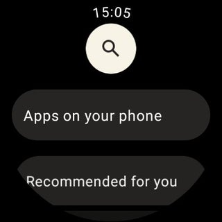
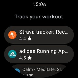
Thirdly, there is a card-based motif on the My Apps updates page. Placing everything in a card makes your screen less shaky, making it more clear and convenient to use. Lastly, the “Open” button is again pill-shaped, light, and stretches to the entire display.
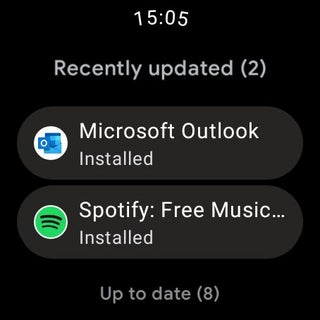
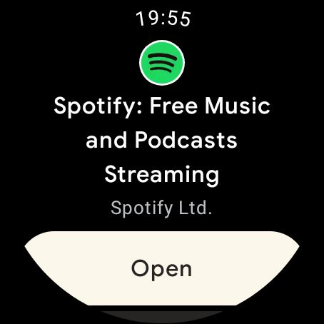
On the other hand, the platform continues to display the list of apps with an icon on the left followed by the name and star rating beneath. To mention, there's a slight color change in the overall platform, the white text on the black background is now a slight grey.
As usual, the update is unfurling to a limited number of users as of now. It will probably take time to arrive at every Wear OS-powered watch.


 1:10 PM
 Simranpal SIngh

