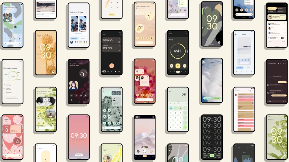
Talking about the biggest visual overhaul in years, Google announced that the stable version of Android 12 will be available later this year. The tech giant has surprised the beta users again with the third beta of the upcoming Android version. Android 12 Beta 3 carries whole new features and changes to your device. Keep scrolling to know about the exciting changes the upgrade will bring.

Android 12 Beta 3 arrives with a bundle of changes for developers that offers a seamless experience. Moreover, it adds a bunch of new features such as scrolling screenshots, revamp set up experience, themed icons, and a lot more. As usual, the beta is limited to Pixel phones as of now
Android 12 Beta 3 Features
Scrolling screenshots will be the most rousing feature in Android 12 Beta 3. Unlike before, this feature will enable the user to take a scrollable screenshot of the screen. This means that the users do not have a capture different screenshots and put them together.
While taking a scrollable screenshot in Android 12 Beta 3, the user will see a “capture more” button in the screenshot preview. Tapping on this button will extend the screenshot to show the entire screen that could also be cropped. Though the capture more button will replace the share and edit options from the preview.
[video width="606" height="1248" mp4="https://www.thegoandroid.com/wp-content/uploads/2021/07/Android-12-Beta-3-Scrolling-screenshots.mp4"][/video]
Better and faster auto-rotate
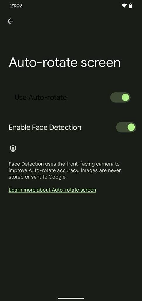
The auto-rotate screen feature has been enhanced in Beta 3. The animation and redrawing of the screen are optimized. Plus, an ML-driven gesture detection algorithm is also added. This makes the interval of auto-rotation reduce by 25%.
Google Pixel 4 and later phones have a face detection feature in addition to this. When enables, this will use the front camera of your device to judge when the screen should be rotated more accurately. To enable this feature, head over to Settings app > Display > Auto-rotate screen > toggle the “enable face detection” option.

Removed colorful icons from Settings
The icons in the Settings app are not colorful now. In fact, they are similar as it was in older Android versions. Probably because Google wanted to make it more consistent.
[gallery link="none" columns="2" size="large" td_select_gallery_slide="slide" ids="116960,116985"]
Customizable "Material You" Theme
Unlike
Android 12 Beta 2, you can now choose the theme palette color depending upon the wallpaper. The current Beta adds a WallpaperPicker app that brings this action. In short, after applying wallpaper, you can again change the system theme color. You can either choose the generated palette options or a basic color theme.
[gallery link="none" size="large" td_select_gallery_slide="slide" ids="116963,116983,116984"]
There is a new “themed icon” toggle in the WallpaperPicker app. Enabling this toggle will apply the system theme to most of your Google apps. However, the theme is not applied to every app, such as the icons for Chat, Find My Device, Play Games, and Tasks were not affected by new effects.
[gallery link="none" size="large" td_select_gallery_slide="slide" ids="116965,116981,116982"]
Disable swipe to invoke assistant gesture
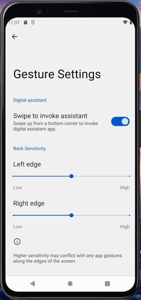
There are times when Google Assistant accidentally invokes by your swiping up from the smartphone. Android 12 Beta 3 has come up with a solution for this. The update offers a google that has an option to disable this gesture. To do this, visit Settings > System > Gestures > System navigation > Gesture navigation, and then tap the cog icon.
The media player is refined and integrated with Android 12. Also, the user can disable the paused media player to display under the Quick Settings panel. To do this, open
Settings > Sound & Vibration > Media.
Additionally, there's a “show media recommendations” option on the Media setting page. However, this function does not function as it is related to the upcoming “Live Space” feature. Once arrives, the “Live Space” widget will show media suggestions whenever an audio device is connected.
[gallery link="none" td_select_gallery_slide="slide" size="large" columns="2" ids="116980,116967"]
“At a Glance” is renamed as “Live Space”
Google has renamed the “At a Glance” widget as “Live Space” in Android 12 Beta 3. Apart from rebranding, there's nothing new in the functionality of this option. However, the “Live Space” widget is expected to receive a new set of features that were not present before. This includes an “at a store” toggle, a media recommendations toggle, and information related to events such as sports and birthdays.
[gallery link="none" size="large" td_select_gallery_slide="slide" ids="116968,116978,116979"]
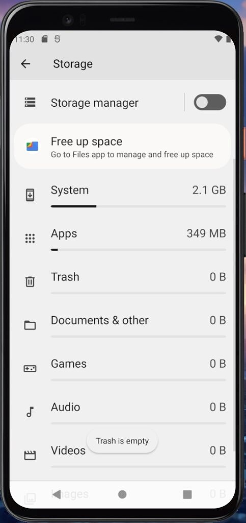
Storage settings show trash storage
The storage setting option will now show the trash storage usage along with the other files. As the name suggests, it displays how much storage the trashed files take.

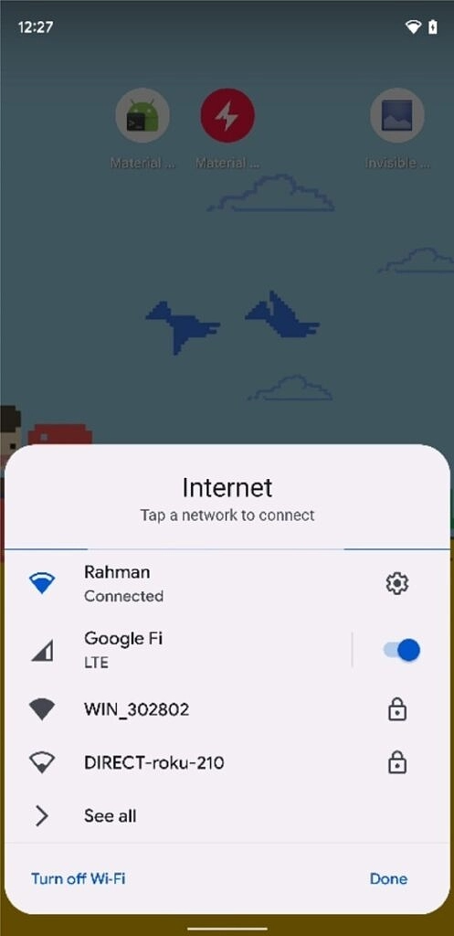
Wi-Fi is merged into the “Internet” panel
The Wi-Fi and mobile data tiles are now combined into one tile called “Internet.” Clicking on this option in Quick Settings will open the internet panel screen. This panel will let you select the Wi-Fi network or toggle mobile data. This might simplify the connectivity experience, but you can not turn off the Wi-Fi directly from your home screen.

Redesigned Bubbles and PIP windows closing experience
In Android 12 Beta 3, the bubble or picture-in-picture window can be seen with a couple of changes. Firstly, the close target (X) button at the bottom is enlarged. Secondly, the animation when a bubble or PIP window is closed is now much clearer.
[video width="606" height="1248" mp4="https://www.thegoandroid.com/wp-content/uploads/2021/07/Android-12-Beta-3-Bubble-closing.mp4"][/video]
The setup screen is revamped
Purchasing a new device or resetting the current one takes you to the SetupWizard app. This guides you to add a Google account, set preferences, connect to the internet, and a few more things. With Android 12 Beta 3, the experience is enhanced as the layout is in coordination with the Material You theme.
[gallery link="none" td_select_gallery_slide="slide" size="large" ids="116972,116973,116974,116975,116976,116977"]
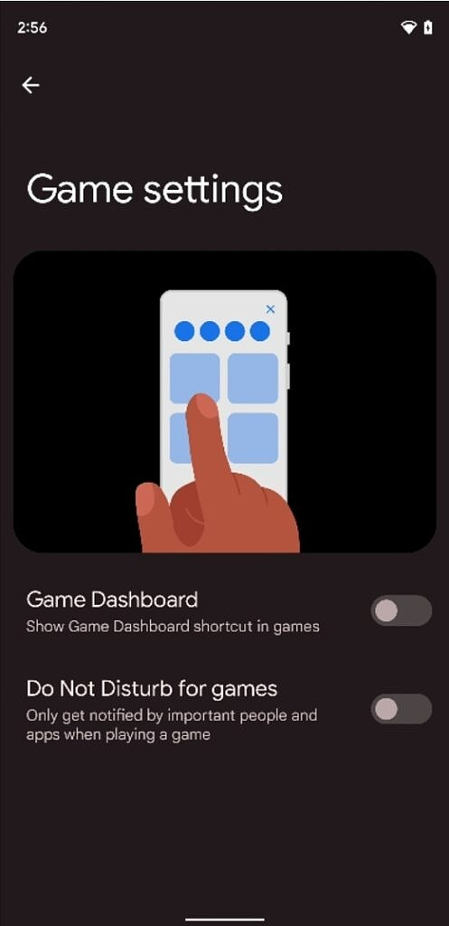
The much-awaited game dashboard is rolled out with Android 12 Bta 3. Once enabled, the user can access the gaming dashboard with utility options like DND, FPS meter, screenshot, and screen recorder. In addition, it will have a shortcut for YouTube Live streaming. However, the features are not fully available in the third beta, but there's a new “Game settings” page that provides the DND and game dashboard enabling options.

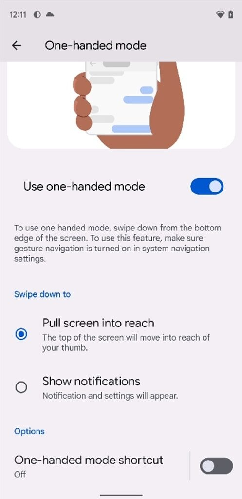
One-handed mode and “swipe for notifications” gestures are combined
Android 12 DP 2 added a “swipe for notifications” gesture and one-handed mode. But, both the options get triggered with the same action i.e; swipe down near the bottom of any screen. The problem got solved in Beta 3, as Google dropped the settings page for the “swipe for notifications” gesture and moved it to the one-handed mode page.

Other Changes
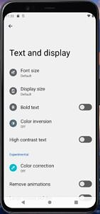
- The “Text and display” menu under the Accessibility settings is rearranged on Google’s part.

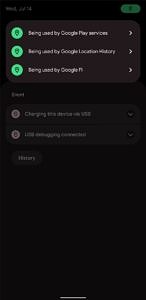
- To serve privacy, there's a feature flag that enables the location indicator alerts.

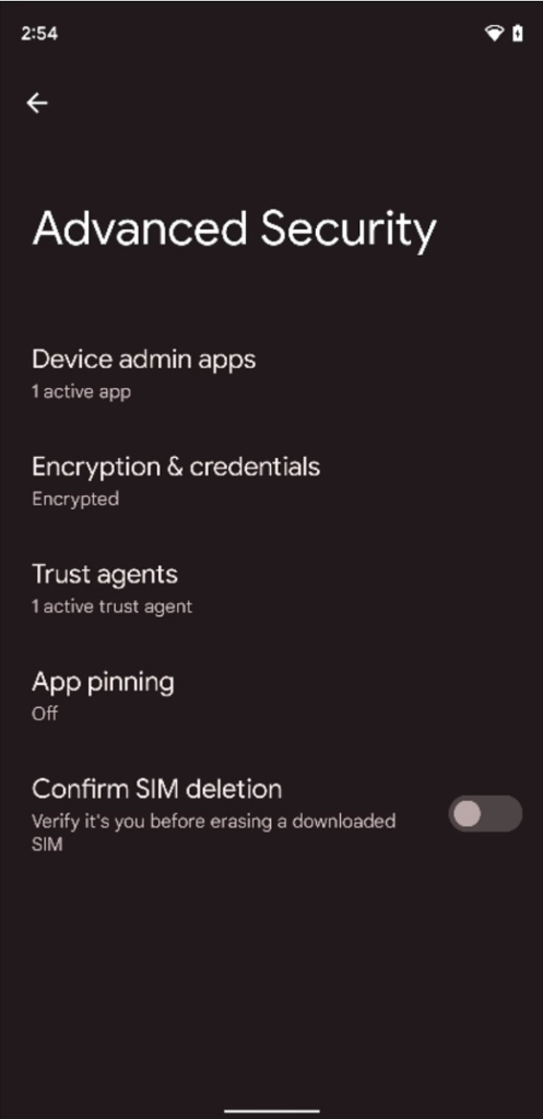
- For security purposes, there's an “Advanced Security” option that lists various settings. The options are taken from the Security settings page.

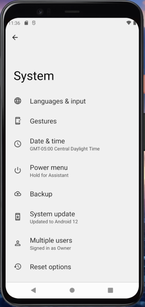
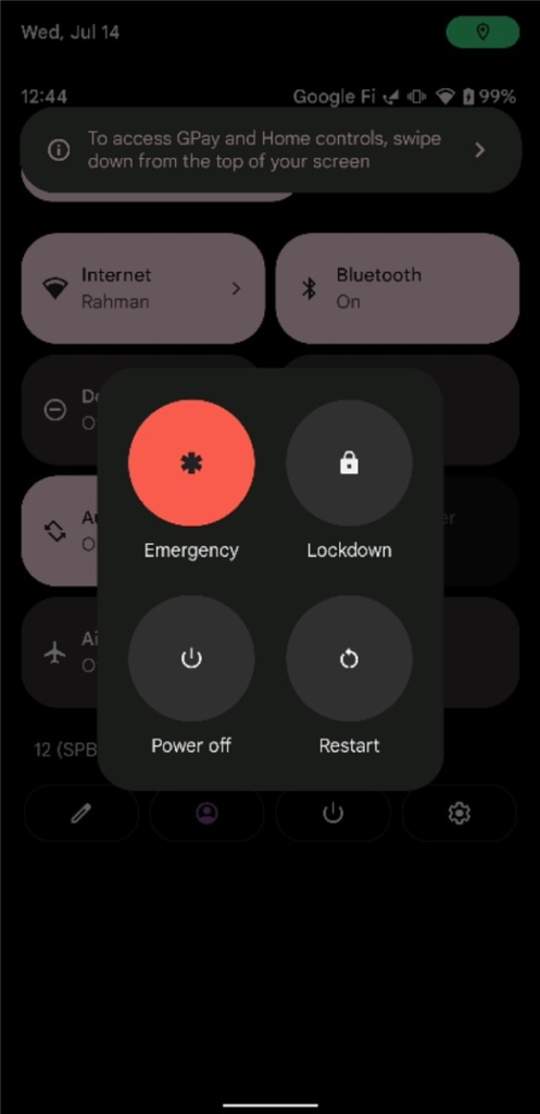
- The power menu settings are now placed directly under “System.”

- Initially opening the power menu in Android 12 Beta 3 displays a tip for the user directing them where are the device controls and quick access wallet feature.

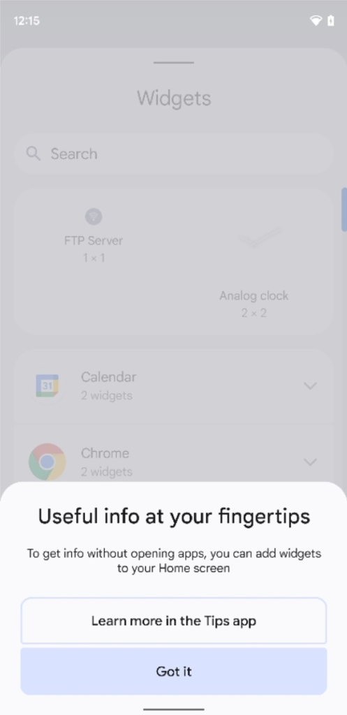
- Pixel Launcher will display a help tip when the user first opens the widget picker to make them aware of the new widgets.

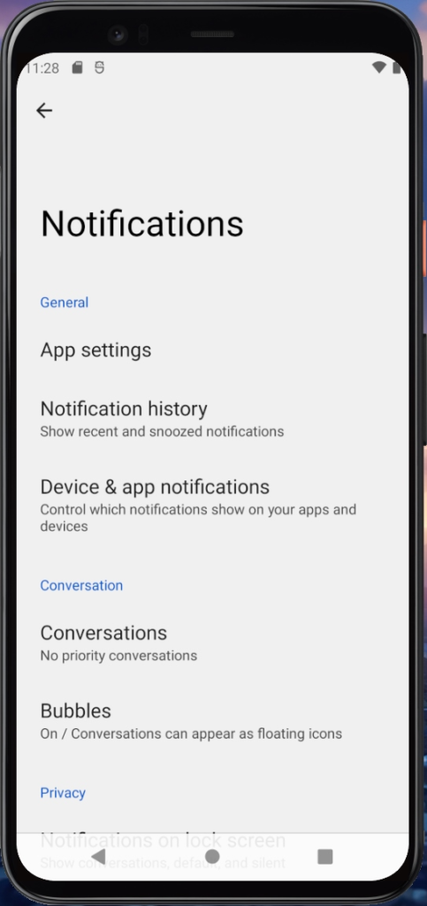
- The general notification section is now up top, and “app settings” enable the user to quickly access managing notifications for apps.

- Pixel phones will now ship with Google Camera 8.3.252, which supports dynamic theming based on the Material You theme.


 1:24 PM
 Simranpal SIngh

