Saturday, October 16, 2021

Google Calculator receives its first post Material You design update

Google has updated all of its apps with the Android 12 based Material You theme. The theme provides a new and modern look to platforms and widgets by making them sleeker. While the other apps are done grabbing the overhaul, the Google Calculator app seems to get something extra.

Google Calculator
Make sure to visit: Best Calculator Android Apps on Play Store

The update can be identified by the Google Calculator v8.1. On top of the new style and color theme, the latest version adds a new animation. On top, it gets a haptic element as well, making it more engaging, tactile, and appealing.

While the Material You update added wider style circular buttons, the new version makes it switch when in use. Whenever pressed, the buttons morph into squares with rounded edges. When released, they return back to their circular shape. Moreover, the Calculator gets haptic feedback on every tap as mentioned earlier.

[gallery link="none" columns="4" size="full" td_select_gallery_slide="slide" td_gallery_title_input="Google Calculator" ids="120309,120310,120311,120312"]

Additionally, the app now provides more advanced function keys in a drop-down menu. In a nutshell, Google Calculator v8.1 will serve all the functions of any advanced calculator in a nicer and more engaging way.
Read more: Google will set up “Quick Phrases” to trigger Assistant without “Hey Google”

Thursday, October 14, 2021

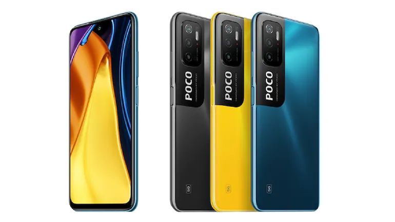
Poco M4 Pro 5G surfaces on FCC with model number 21091116AG

Xiaomi seems to be all buckled up to offer new smartphones in the market. While the company is preparing a new Mix Fold that can rival Galaxy Z Fold 3. A new device by the company, Poco M4 Pro 5G made it to the Federal Communications Commission (FCC), with model number 21091116AG.

Poco M4 Pro 5G
Make sure to visit: What is Android Instant Tethering and How to use it (Complete Guide)

Before the FCC certification, the Poco M4 Pro 5G has made an appearance in the IMDA certification as well. Besides the supported model number, the listing reveals the details regarding the operating system, storage configuration, and connectivity options the device will have.

The FCC listing discloses that the Poco M4 Pro 5G will have MIUI 12.5 on board. With this skin level, it is likely to arrive with the Android 11 operating system out of the box. Furthermore, the device supports a 5G network with n77 and n78 5G bands onboard. Also, it will offer connectivity options like dual-band Wi-Fi, Bluetooth 5.2, GPS, and NFC. On the storage front, the handset will be available in two configurations— 64GB and 128GB paired with 4GB RAM and 6GB RAM respectively.

[gallery link="none" columns="4" size="full" td_select_gallery_slide="slide" td_gallery_title_input="Poco M4 Pro 5G- FCC" ids="120285,120286,120287,120288"]

The arrival of the Poco M4 Pro 5G on the IMEI database divulged the fast-charging capacity and hinted at the possible processor. The smartphone will support 33W fast charging and will probably equip a MediaTek processor.

Now that the Poco M4 Pro 5G is listed on all the major certifications, we can expect more information to reveal soon. Also, the device will not take much time to debut in the market.
Read more: Xiaomi Mi 12 leaks: ceramic body, Snapdragon 898 SoC, 5000 mAh battery

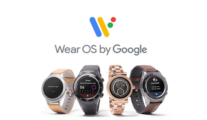
Google Clock on Wear OS enters Material You design club

Google has successfully applied its new Material You theme to all of its major apps like Gmail, Google Photos, Play Store, and more. Now, the tech giant is shifting its focus to smaller platforms starting with Google Clock. The app is finally joining the Material You design club.

Wear OS
Make sure to visit: Specs Comparison: OnePlus Nord 2 vs Google Pixel 5a 5G

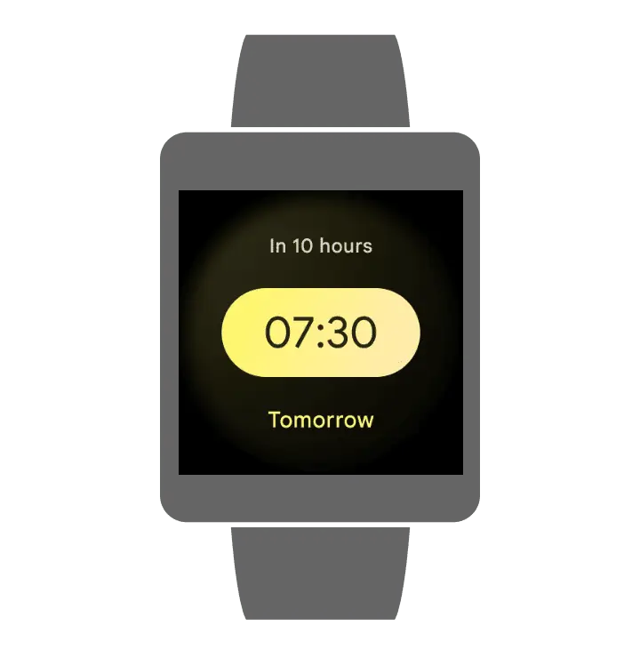
The Alarm tab under the Google Clock gained a title depth with the Material You makeover. Instead of the black and blue color scheme, the time is now displayed in a yellowish pill set at the center of the screen. Above it, you can see the time pending for the alarm to ring in a semi-opaque circle. Here's a picture below for your reference.


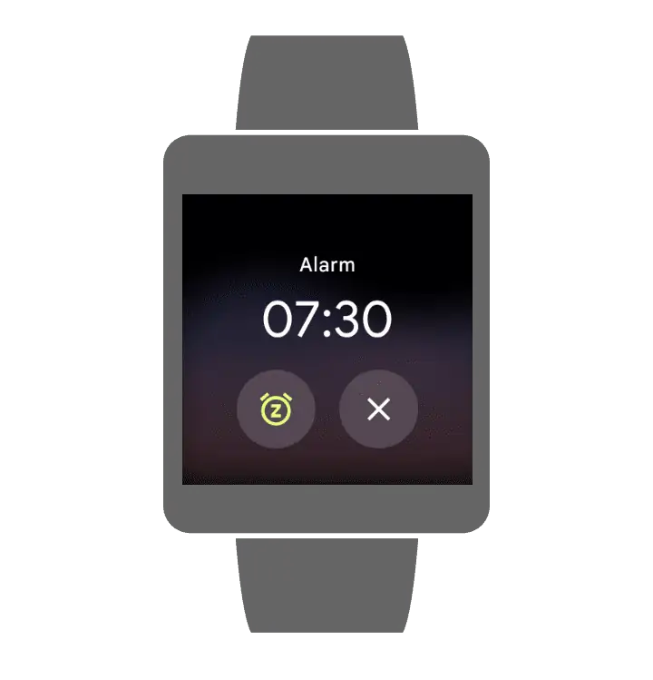
When the time is finally completed and the alarm rings, you can notice a blur two-tone texture in the background. The time along with snooze and dismiss options are shown on the screen as in the picture below.


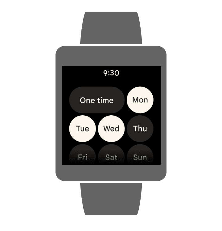
If you want to repeat the alarm, you will notice large and bubbly buttons for the purpose. These buttons also represent a slightly yellow tint, with no fancy background.


While for the timers, the color is changed to turquoise. Unlike before, the list view will be easier to read with larger fonts housed in large-shaped pills. Moreover, it shows a large circle that you can rotate accordingly. The circle rotates vertically in a carousel fashion to reset hours, minutes, and seconds.


[gallery link="none" size="full" td_select_gallery_slide="slide" ids="120269,120270,120271"]


Talking about the stopwatch, it has a large circle of blue dots. The time, reset button and stop buttons are in the middle. The circle looks solid with a color change, again. This time, it is peach.

[gallery link="none" columns="2" size="full" td_select_gallery_slide="slide" ids="120267,120268"]
FYI, we are not sure when the update will roll out as the Google clock for Wear OS is still in the current design.

Related: Galaxy Watch 4's latest update causing trouble in tracking heart rate 

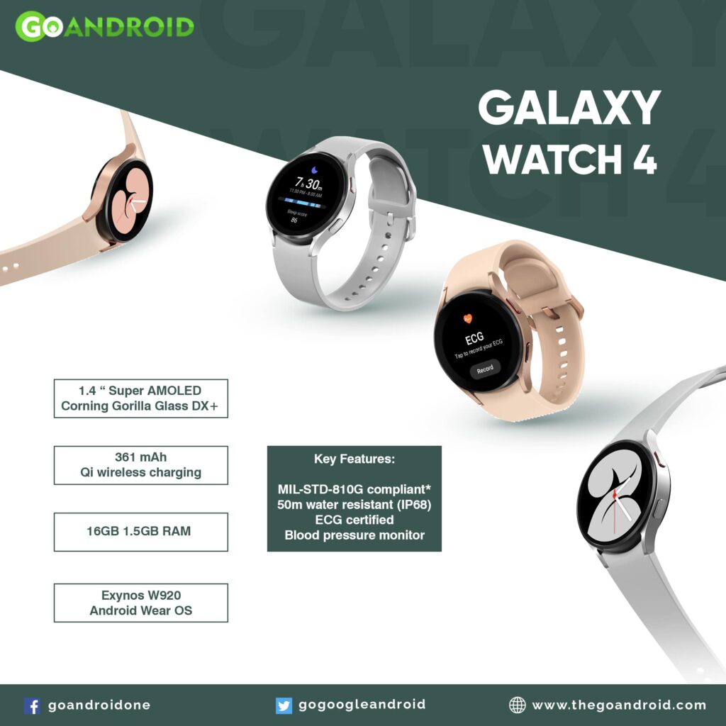
Galaxy Watch 4's latest update causing trouble in tracking heart rate 

For the first time ever,  Samsung dumped its Tizen OS for WearOS. This resulted in an exceptional performance of the Galaxy Watch 4 series. But as nothing comes perfect, the wearable also has some flaws. This includes variations between Google Fit and Samsung Health data, weak body, and syncing concerns with Play Services.


Must see: How to Setup Insignia TV

Though the above-mentioned points are minor, or we can say neglectable. While the major issue with the Galaxy Watch 4 is that it is not tracking the heart rate accurately during workouts. Reason being for calling it a significant concern is that it targets workout freaks. Thus, basic functioning like heart rate monitoring shouldn’t be a problem.


The affected users complained the numbers do not represent their actual stats. Also, this is tested comparing with the other heart rate monitoring gadgets. Now, where users were hoping for an update that'd resolve the trouble, Samsung has removed the feature on the Galaxy Watch 4!

A set of time bars showing the average heart rate replaces the continuous heart rate graph. Confirming this, a Samsung representative admitted that this change is a part of the latest update to the Health app. Talking about the latest update, it was released almost a week ago with version v6.19.1.001. Here are the changes it carries.

What's New?


  • Gather all information such as Profile, Weekly Summary, Rewards, and Personal Best that are scattered and provide them integrated on My Page.

  • Add more gender options to make it easier for anyone to choose a gender. (“Others”, ”Prefer not to say”)

  • Various bug fixes and improvements applied


There's nothing mentioned about the removal of the continuous heart rate graph. But if you require this function, all you need to do is switch back to the previous version 6.18 or older.

[via]
Read more: List of Samsung devices receiving RAM Plus feature

Wednesday, October 13, 2021

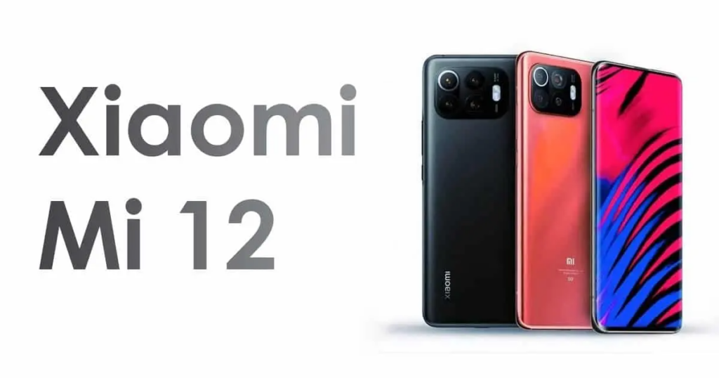
Xiaomi Mi 12 leaks: ceramic body, Snapdragon 898 SoC, 5000 mAh battery

After the successful launch of the Xiaomi Mi 11 series, the successor flagship has started to appear in leaks. According to the latest rumors, the Mi 12 will feature a similar design to the recently launched Civi series. FYI, the company claims this as the most beautiful smartphone in its history.

Xiaomi Mi 12

Make sure to visit: Specs Comparison – Motorola Moto E40 vs Xiaomi Redmi Note 8

The recent reports about Xiaomi Mi 12 reveal more details regarding the body and design of the smartphone. Also, the improvements over the Mi 11 series in terms of look and features.

As per the reports by Digital Chat Station, the Mi 12 will flaunt thinner bezels and chin for a better visual experience. Moreover, it will have a hyperboloid solution, offering a higher screen-to-body ratio than the Xiaomi Mi 11 lineup.

The leaks suggest that the Xiaomi Mi 12 will use dual-core materials and design thus, increasing the energy density. Also, the smartphone is tipped to pack a 5,000 mAh power cell under a ceramic back panel. Joining the dots, the device could feature a slimmer body while housing a larger capacity battery.

The Mi 12 is likely to draw power from an unannounced Qualcomm Snapdragon 898 SoC. In that case, it will be the first device to equip this chipset. For shooting purposes, the handset can probably carry a triple rear camera lead by a 200 MP sensor accompanied by a couple of 50MP lenses.

This is all we have at the moment while we have no official words from the Chinese giant. The rest of the secrets will be disclosed with time passing by.
Read more: Xiaomi sends a major update to Mi 11 Ultra with August 2021 Security Patch

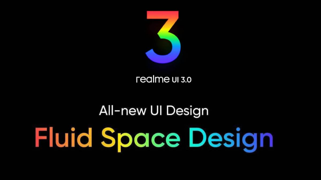
Best Realme UI 3.0 features - Fluid Space Design, Richer Color Rendering, and others

A week after announcing its next-gen skin based on Android 12, Realme finally launched the Realme UI 3.0. We expected the skin to arrive with a major overhaul with UI, animation, features, and more. Well, now that it is official, here is everything you will experience with the latest skin!
Realme UI 3.0

Must see: Download Realme UI System Launcher v11.3.00 [Old Versions Archive]

Realme GT was the first device to join the Android 12 developer beta program. Therefore, it will be the first smartphone to grab Realme UI 3.0 beta as well.

Best Realme UI 3.0 features


As claimed by Realme, the new Android 12 based Realme UI 3.0 skin is "more fluid, the layout is more spatial, & the overall UI experience is more expressive."

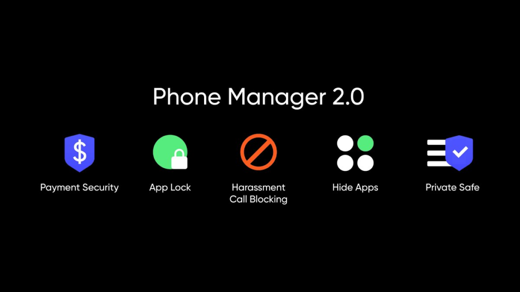
Phone Manager


Realme UI 3.0 brings the reconstructed phone manager that performs all the smart tasks. Moreover, it optimizes the performance and clears junk without any interruption. Thus, your storage and battery life always gets a boost!

Private Sharing


With Realme UI 3.0, you can see the list of apps asking for permissions in graphics. Also, all the control will be under your influence as you can get detailed information about the use of specific applications.

[gallery link="none" size="full" td_select_gallery_slide="slide" ids="120217,120218,120219"]

Secure Privacy


As privacy is the major focus of Android 12, you also get updated privacy functions with Realme UI 3.0. This implies, your data and information are safer than ever before. The skin offers a new feature that enables you to share pictures or videos privately.

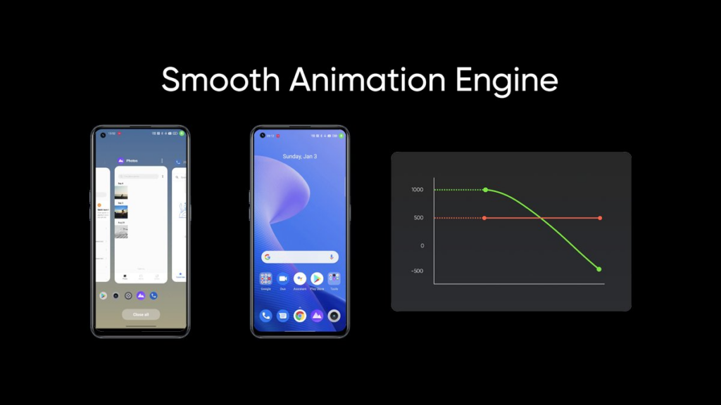
Smoother Animations


Realme UI 3.0 has a new AI animation engine providing an optimized experience. It determines the dynamic change to give a more fluid experience. Moreover, it supports floating window 2.0 that you can control as per convenience.

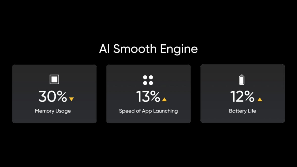
AI Smooth Engine


The AI memory compression of the RealmeUI 3.0 enhances the rate of memory usage and lets different programs launch more smartly. This engine increases battery life by 12% and improves the app launching performance by 13%.

Fluidity


The AI smooth engine in Realme UI 3.0 emphasizes giving a fluid experience. It provides a more seamless experience by adding smoothness all over the system and reducing power consumption.


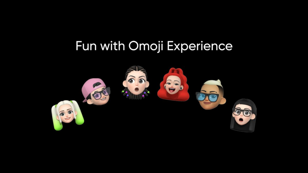
Omoji


Omoji is a 3D avatar feature that enables the user to create a personalized virtual look imaginatively. Realme UI 3.0 offers over a dozen of Omojis from everyday life including ghosts, food, objects, and more. Also, there are a variety of dynamic wallpapers for a vibrant experience. You can also download the Omoji app on your devices from below

Download Omoji Avatar App v1.0.0


Personalized AOD


Realme Ui 3.0 allows you to fully alter the AOD by simply uploading the picture and enjoying the unique designs.

[gallery link="none" size="full" td_select_gallery_slide="slide" ids="120227,120228,120226"]

Personalization


Personalization is the base of Android 12 and Realme UI 2.0. You can customize all the icons, backgrounds, fonts, and other elements as per your taste.

[gallery link="none" size="full" td_select_gallery_slide="slide" ids="120231,120230,120229"]

Spatial Layout


Realme UI 3.0 offers a spatial layout interface with the title size, symbol, and text contrast all enhanced. It gives a sense of importance and concentration concerning the information they receive.

[gallery link="none" columns="2" size="full" td_select_gallery_slide="slide" ids="120232,120233"]

3D icons


The icons are now displayed with a 3D layout in Realme UI 3.0. It uses a semitransparent Design with weighted outlines with overlapping objects, providing a younger feel. With all this adjustment, it adds a fun 3D vibe.

[gallery link="none" size="full" td_select_gallery_slide="slide" ids="120236,120235,120234"]
Related: All about Oppo ColorOS 12- release date, features, and more

Samsung Galaxy Buds 2 grabs a new update, improving its stability

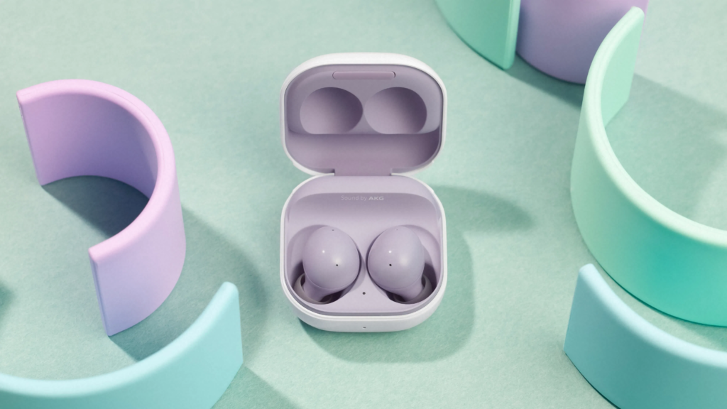
The Galaxy Buds 2 has proven to be the best earbuds by Samsung so far. And the company is in no way jeopardizing it. After releasing a couple of updates last month, Samsung is again pushing another update to the Galaxy Buds 2 to polish the user seamless experience.

Galaxy Buds 2

Make sure to visit: [Download] Samsung Good Lock Pentastic update bears Air command customization

The fresh update for Galaxy Buds 2 arrives on the firmware version R177XXU0AUI9 weighing less than 3MB in size. As you might have guessed, the build is not major, it enhances the system stability and optimizes the system performance. That implies after flashing the update, the user will not have to face any issue in case they were experiencing it earlier.

As of now, the update is rolling out in South Korea as mentioned by Samsung. Though it's not going to take much time to reach other countries. If you are a Galaxy Buds 2 owner, you can manually check for the firmware via the Wearable app on your connected smartphone.

Prior to flash the update, make sure to connect both of the buds to your smartphone. Also, Samsung has mentioned that some default settings for the earbuds may change.
Read more: Samsung Capture v4.8.04.2 reports crash of scrolling screenshot function

Tuesday, October 12, 2021

Specs Comparison – Motorola Moto E40 vs Xiaomi Redmi Note 8

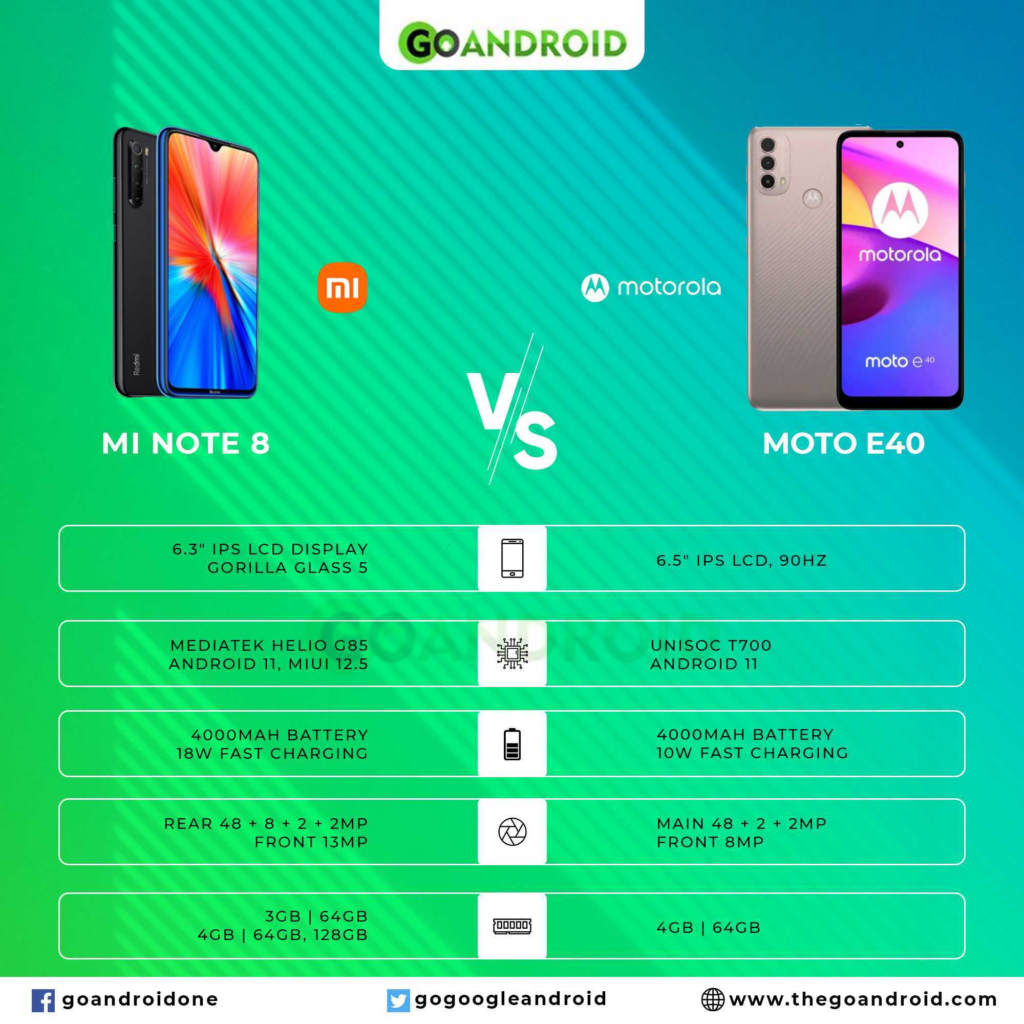
Thinking of purchasing an entry-level smartphone? Well, here we have a couple of options costing less than INR 13,000. Motorola recently launched the Moto E40 smartphone while it has been two years since Xiaomi introduced the Redmi Note 8. Yet, the devices have some similar features. You can see the comparison between the two handsets based on their key specs here.

 Moto E40 vs Mi Note 8

Must see: How to troubleshoot Insignia TV & Fix issues

Before heading to the differences, let's know about the common grounds of Motorola Moto E40 and Xiaomi Redmi Note 8.

Similarities


  • Both offer IPS LCD screens with Dual SIM capabilities

  • eMMC 5.1 storage which is expandable via microSDXC slot

  • The primary rear camera stands the same at 48 MP

  • Few same connectivity features— GPS with A-GPS, GLONASS, USB Type-C 2.0

  • Equal sensors onboard— rear-mounted fingerprint, accelerometer, proximity


Only the above-mentioned points are homogenous for Moto E40 and Redmi Note 8. Needless to say, they differ on all the major grounds including screen size, processor, camera, and other functionality. To make this difference simple for you, we have portrayed a table emphasizing the major factors.

Motorola Moto E40 vs Xiaomi Redmi Note 8


[table id=44 /]
Related: Specs Comparison: Poco X3 vs Realme X7!

Realme 3 Pro picks up Android 11 stable update with Realme UI 2.0

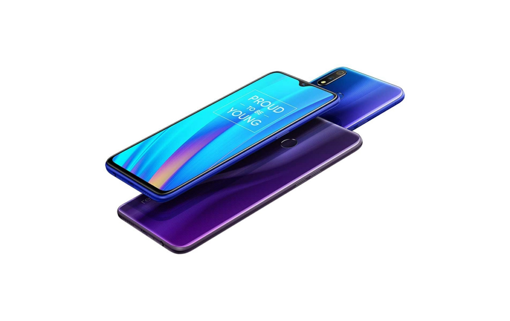
While Android 12 could launch any time sooner, Realme is still not done releasing the latest stable operating system to its flagships. The 2019 launched Realme 3 pro is finally receiving the stable Android 11 update based on Realme UI 2.0.

Realme 3 Pro

Make sure to visit: How to unlock the bootloader of Realme 3 Pro?

While the previous Android 11 Realme UI 2.0 update for Realme 3 Pro was only limited to the beta testers. This time, the package is available for every user via the firmware version RMX1851EX_11_F.05.

Regarding changes, the software will endorse all that we expect from Android 11 and the extensive features of REalme UI 2.0. Besides, the company has also issued a detailed changelog that claims to fix several issues across the system. Moreover, the security patch will also be upgraded to August 2021.

Changelog


  • System

    • Optimizes system performance and improves system stability.


  • Wireless

    • Boosts Wi-Fi performance with stronger signal across Wi-Fi channels.


  • Camera

    • Fixes an issue that might cause the Camera app to freeze when using the rear camera in Portrait mode.

    • Fixes an issue where the Camera app might freeze when you switch to the front camera, turn on the flashlight, and then switch to another shooting mode.

    • Fixes an issue where the Camera app might stutter when taking burst photos in bright light outdoors.


  • Realme UI

    • Fixes an issue where the search box and the navigation buttons might overlap in Guest mode.

    • Fixes an issue where apps might appear in the wrong place in the Recents screen when you switch to the Recents screen from Split screen view.


  • Apps

    • Fixes an issue that might cause ambient sound to disappear when you turn voice chat on and then off in games.


  • Security

    • Integrates the August 2021 Android security patch to enhance system security.


As the package is rolling out in phases, it may take some time to hit every unit. Meanwhile, you can also track the update manually via Settings > Software update.
Also visit: [Update] Download Realme Games v1.0.2 App