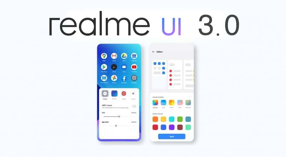
With the arrival of Android 12, all the major smartphone brands are busy developing their customized skin. Realme is also in the race as the first look of Realme UI 3.0 is revealed in the render leaks. The company officially announced the Realme UI 3.0 during the Realme GT Neo 2 launch event. Keep scrolling to know what it looks like!
Make sure to visit: [Update] Download Realme Soloop Video Editor v1.42.1 [Old Versions Archived]
The new Realme UI 3.0 skin based on the latest operating system, Android 12 is likely to hit Realme GT 5G as an OTA from October 13. The device's model in China will receive a closed beta prior to this update. Here we have some leaks and images of the new look the next-gen is going to offer.
It seems that the new user interface is inspired by ColorOS 12. Particularly, the widgets look similar to Oppo's customized skin— ColorOS 12 beta as per the images leaked. Though this isn't surprising as the previous versions of Realme skin were also based on ColorOS.
[gallery link="none" columns="4" size="full" td_select_gallery_slide="slide" td_gallery_title_input="Realme UI 3.0" ids="119934,119935,119936,119937"]
However, the icons are noticeably different between Realme UI and ColorOS. Additionally, there is a new floating windows feature and redesigned quick settings toggles for a more seamless experience and quick action.
The Realme UI 3.0 is likely to bring numerous refreshing features apart from the new user interface making it more user-friendly. Moreover, some minor changes concerning customization are likely to arrive. You can read all that we know about Realme UI 3.0 by tapping on the button below.


 6:17 PM
 Simranpal SIngh


0 comments:
Post a Comment
Share Your Views Here