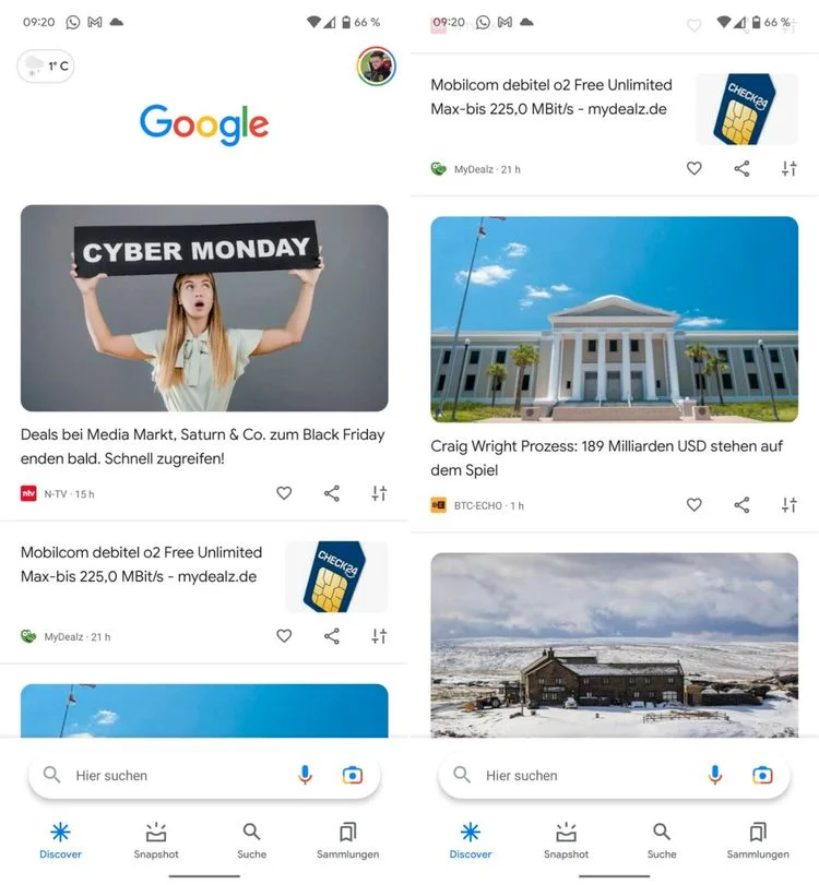
Just like Apple, Google is also improving the one-handed usage of its first-party apps. Several apps on the Android 12 Material You theme have most UI elements shifted to the bottom. Yesterday, the Google Chat app on Android also got a new bottom bar UI for better reachability. Now, a similar update is unfurling to the Google Search app where the search bar is shifting to the bottom.
Make sure to visit: How to access NFC based Tap and Pay on Google Pay India
With the bottom search bar, it will become easier to use one-handed mode and everything from scrolling to searching will be in the reach of your thumb. To mention, unlike other Google apps, this is not a Material You update. It is just a change in the placement of the search bar which is falling in line with Google's current launcher design. Though we can expect the Material You update for the Google Search app as most of its first-party app now follows the same theme.

The change is a part of the Google App beta version 12.47.12. For now, the switch is not noticeable for very beta users. It is probably having a slow rollout. So, we can say that the public rollout is not near anyway! But you can try flashing the beta version from the link below.
Download Google Search App Beta 12.47.12


 11:32 AM
 Simranpal SIngh


0 comments:
Post a Comment
Share Your Views Here