Wednesday, December 1, 2021

Chrome OS 96 bring Camera improvements and Nearby Share support

Every four weeks, Chrome OS gets a new update refining the user experience. Similar is the case this time with the latest version— Chrome OS 96. The new update brings along numerous features and other changes. Let's take a look at the details.


Must see: Download new ChromeOS Wallpapers

Besides the minor changes, Chrome OS 96 is prepared to deliver several improvements on the camera front and add the Nearby Share support. For the camera section, the latest version adds a native document scanner that can convert images to JPG or PDF. After updating, you will get a “Scan” tab where the QR code section was placed before. Also, it will detect edges that will be adjustable.

Additionally, you can now also control the angle and crop picture via Pan-Tilt-Zoom if you are using an external camera. For this, there's a D-Pad section on the left portion. Moreover, Chrome OS 96 brings support for Nearby Share that can be accessed via Android apps. Also, you can share sheets that were earlier limited to system apps, Progressive Web Apps, and the Files app.

Furthermore, Chrome OS 96 brings some minor changes like the “Manage your apps” list and a section for “Opening supported links”. This is here to let you know if a link is opened in the Chrome browser and an installed client. Lastly, you can notice a bigger grid UI on the Wallpaper app. Plus, unlike before, you can directly access it from an app launcher.
Read more: Google Search app shifts search bar to the bottom

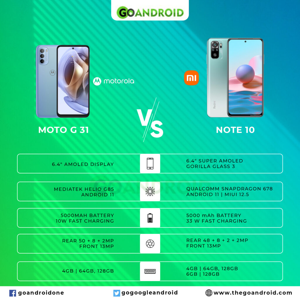
Specs Comparison: Motorola Moto G31 vs Xiaomi Note 10

The Lenovo-owned company recently launched a new budget device from its G-series flagship, Moto G31. While the Xiaomi Mi Note 10 came to light a couple of years back. Here we will compare both of these budget devices on the basis of their key specs so you can choose the better one yourself!

 Moto G31 vs Mi Note 10

Must see: Black Friday Deals: Grab OnePlus Nord N200 for $99

Before heading to the differences, let's take a look at the common grounds of Moto G31 and Mi Note 10.

Similarities


  • Supported network: GSM / HSPA / LTE

  • Panel: AMOLED type

  • Connectivity: dual-band, Wi-Fi, Bluetooth 5.0, GPS with A-GPS, GLONASS, GALILEO, FM Radio, USB Type-C 2.0

  • Sensors: fingerprint, accelerometer, gyro, proximity, compass


As you might have noticed, there aren't many factors of the two devices that we can consider homogenous. So here we have crafted the difference between Moto G31 and Mi Note 10 in a tabular form to make it easier for you to take a glimpse.

Moto G31 vs Mi Note 10


[table id=48 /]
Related: Comparing Xiaomi Civi and Oppo Reno 7 5G

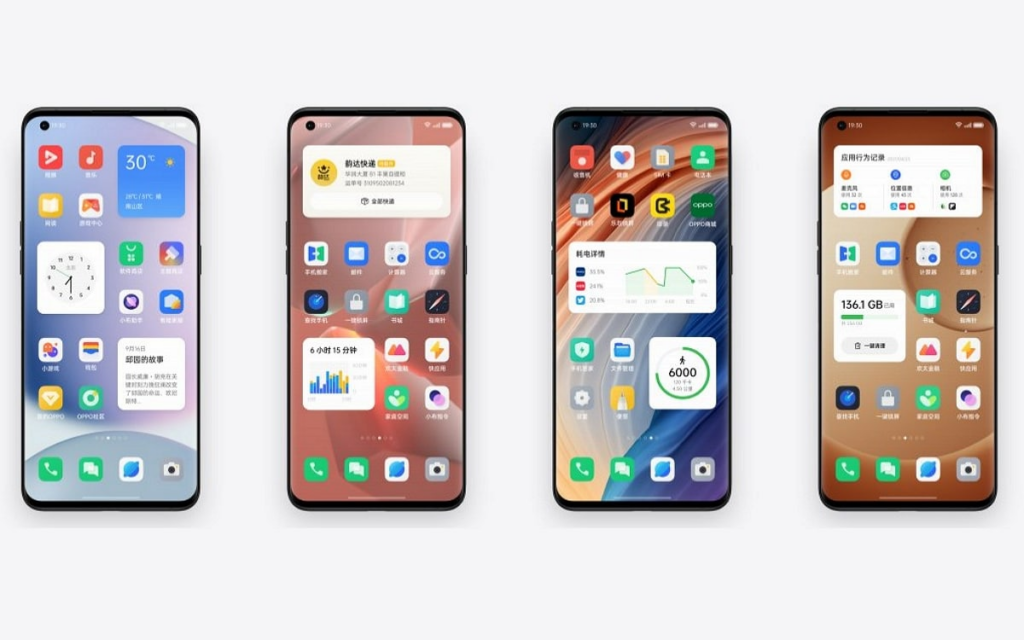
MIUI Launcher gets a low-key animation for MIUI 13

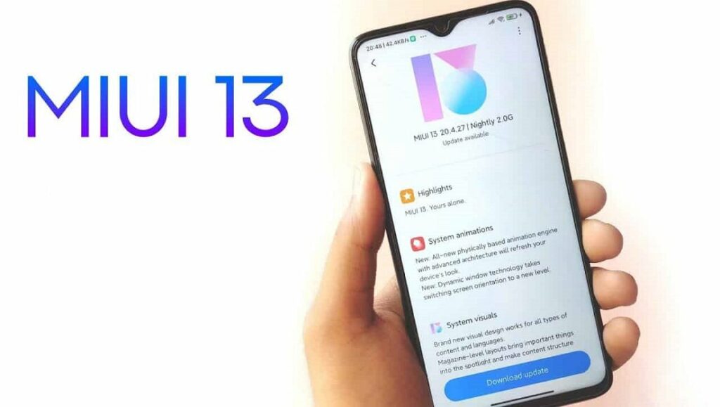
Like every smartphone brand, Xiaomi is also all geared up to prepare its next-gen customized skin. Rumors suggest that the MIUI 13 will launch alongside the Xiaomi Mi 12 on December 16. While this is not yet confirmed, there are already developments on the MIUI 12.5 beta channel.

MIUI 13

Make sure to visit: Xiaomi and Redmi Android 12 update list [Unofficial]

In the latest news, the MIUI Launcher Alpha is getting a low-key yet important animation. This animation is when an app is loading, like following a reboot, a loading icon will appear on the screen to show that the app is not loaded. This all seems to be a part of MIUI 13 preparation. Moreover, the update resolves a number of bugs and issues that were a part of previous Alpha builds.

Previously, when the apps used to pop up one by one and the launch would restart after stuttering. It stops the user from using the launcher until it is fully prepared.

These animation and bug fixes are a part of MIUI Launcher Alpha v4.26.0.4048-11301642. You can visit the link provided at the end of this page to flash the APK file. However, the build may not work on Global ROMs but it will definitely work for Xiaomi.eu users.
Read more: Xiaomi launched Redmi Note 11 4G with Helio G88 SoC, triple rear-camera, and more

Google Search app shifts search bar to the bottom

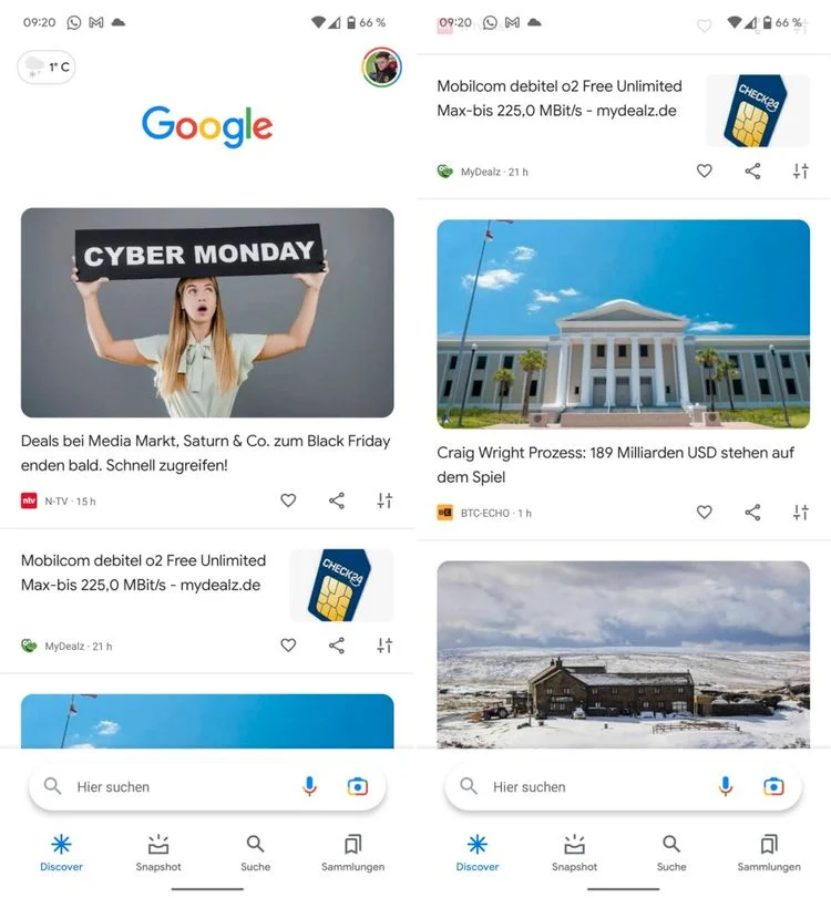
Just like Apple, Google is also improving the one-handed usage of its first-party apps. Several apps on the Android 12 Material You theme have most UI elements shifted to the bottom. Yesterday, the Google Chat app on Android also got a new bottom bar UI for better reachability. Now, a similar update is unfurling to the Google Search app where the search bar is shifting to the bottom.

Google Search app

Make sure to visit: How to access NFC based Tap and Pay on Google Pay India

With the bottom search bar, it will become easier to use one-handed mode and everything from scrolling to searching will be in the reach of your thumb. To mention, unlike other Google apps, this is not a Material You update. It is just a change in the placement of the search bar which is falling in line with Google's current launcher design. Though we can expect the Material You update for the Google Search app as most of its first-party app now follows the same theme.

Google Search app

The change is a part of the Google App beta version 12.47.12. For now, the switch is not noticeable for very beta users. It is probably having a slow rollout. So, we can say that the public rollout is not near anyway! But you can try flashing the beta version from the link below.

Download Google Search App Beta 12.47.12


Read more: Google Photos adds a new shortcut to reach the Screenshots folder quickly

Android TV 12 is now available for developers!

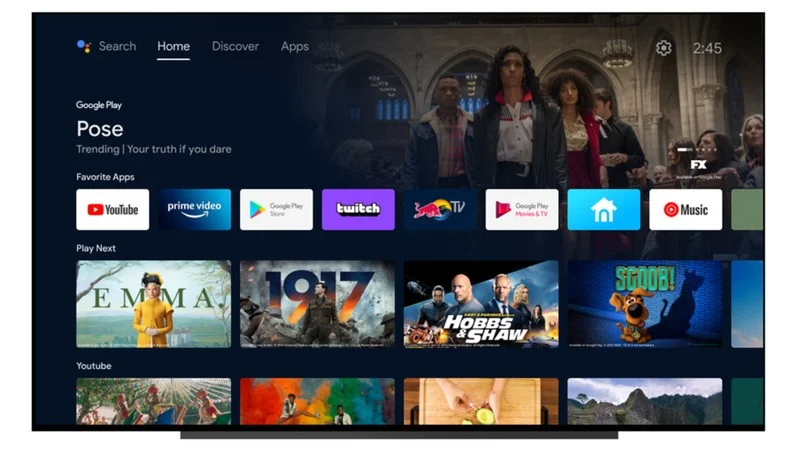
All the respective brands have started to roll out Android 12 to their eligible smartphones for almost a month now. And now finally, its Android TV users turn to get the taste of the latest operating system. However, it is only available for developers at the moment. But we know it's just a matter of time!

Android TV 12

Must see: List of Asus smartphones to get Android 12

Also, You can not flash Android 12 on your Chromecast or Shield TV as of now. To do so, you have to get Google's development box, ADT-3. While the rest of the users have no other choice to wait for the official update, which will hopefully arrive in a month or so.

As far as changes are concerned, you will get some changes in the UI, like 4K support, background blur, font sizes under accessibility. Along with a tuned-up UI, Android TV 12 will bring all the security features you get on a smartphone, including privacy indicators. For more details on the development, read the changelog below.

Android TV 12 changelog


Media

  • Avoid motion judder during playback using refresh rate switching

  • Certified API-accuracy for reporting display modes, HDR formats, and surround sound formats


User Interface

  • Background blurs using RenderEffect and in WindowManager

  • 4K UI support

  • Accessibility settings for font sizes


Privacy & Security

  • Microphone and camera indicators

  • Microphone and camera toggles

  • Device attestation via Android KeyStore API


HDMI & Tuner

  • Support for HDMI CEC 2.0

  • Tuner HAL 1.1 with DTMB support and performance improvements

  • Better protection model with Tuner Service


All in all, these changes will not reform the way you operate your Android TV, but they will refine and polish the current experience.
Read more: List of Nokia devices to get Android 12 update

Tuesday, November 30, 2021

Oppo ColorOS 12 update timeline for December 2021

With the introduction of Android 12, every smartphone brand including Oppo has prepared its customized skin based on the latest operating system. The company introduced the ColorOS 12 with the concept of "Just Sync." Every month the Chinese giant prepares a timeline for the rollout of current skin for its flagship. This time, the December 2021 schedule is out just a day before the beginning of the month.

ColorOS 12

Must see: Download Oppo Mail App Version v12.0.18 [Old Versions Archive]

Oppo has unveiled the ColorOS 12 rollout plan for its devices in the home country, China. A total of 11 devices will get access to open beta builds. While 8 flagships will get the stable package. Check if your device is eligible for the latest update this month from the list below.

Oppo ColorOS 12 update timeline for December 2021


Open Beta


  • December 1


  • December 10

    • OPPO Reno5 Pro 5G


  • December 15

    • OPPO A95 5G


  • December 23


  • December 28


  • December 29


Stable


Important: Keep in mind that this timeline is subject to change depending on various factors.
Read more: The latest update for Oppo Enco TWS adds new features

Comparing Xiaomi Civi and Oppo Reno 7 5G

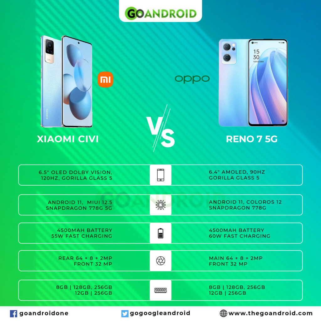
Out of numerous smartphones launched recently, two high-end smartphones are owned by Xiaomi and Oppo. These devices are Xiaomi Civi and Oppo Reno 7 5G. Both smartphones fall under the same price segment. So if you are confused about which one you want to go for, here you can see the comparison between them and make your own wise choice.

Xiaomi Civi and Reno 7 5G

Must see: Best Android smartphones under $400

Despite falling under the same category, there is a lot of difference in the price range of Xiaomi Civi and Oppo Reno 7 5G. On a contrary, the devices offer several similar specifications which are listed below:

Similarities between Xiaomi Civi and Oppo Reno 7 5G 


  • Network: Dual-SIM support (Nano-SIM, dual stand-by) with LTE, 5G technology

  • Display: The display offers a 1080 x 2400 pixels resolution, a 20:9 ratio, and Corning Gorilla Glass 5.

  • Operating System: Android 11 pre-installed

  • Processor: Octa-core CPU, Qualcomm Snapdragon 778G 5G, Adreno 642L GPU

  • Storage Configuration: 128GB 8GB RAM, 256GB 8GB RAM, 256GB 12GB RAM

  • Rear Camera: 64 MP wide, 8 MP ultrawide, and 2 MP macro

  • Front Camera: 32 MP Wide

  • Connectivity: dual-band Wi-Fi, Wi-Fi Direct, hotspot, Bluetooth 5.2, GPS with A-GPS, USB Type-C 2.0, USB On-The-Go

  • Sensors: Under display Fingerprintaccelerometer, gyro, proximity, compass

  • Battery Capacity: 4,500 mAh


Now you know that the Xiaomi Civi and Oppo Reno 7 5G have major common grounds, let's take a look at their differences. We have crafted it in a tabular form so it is quick and easy for you.

Difference between Xiaomi Civi and Oppo Reno 7 5G 


[table id=47 /]

Related: Comparing Samsung Galaxy F42 5g vs Galaxy M52 5g

Nokia 2.4 receives Android 11 with November 2021 Security Patch

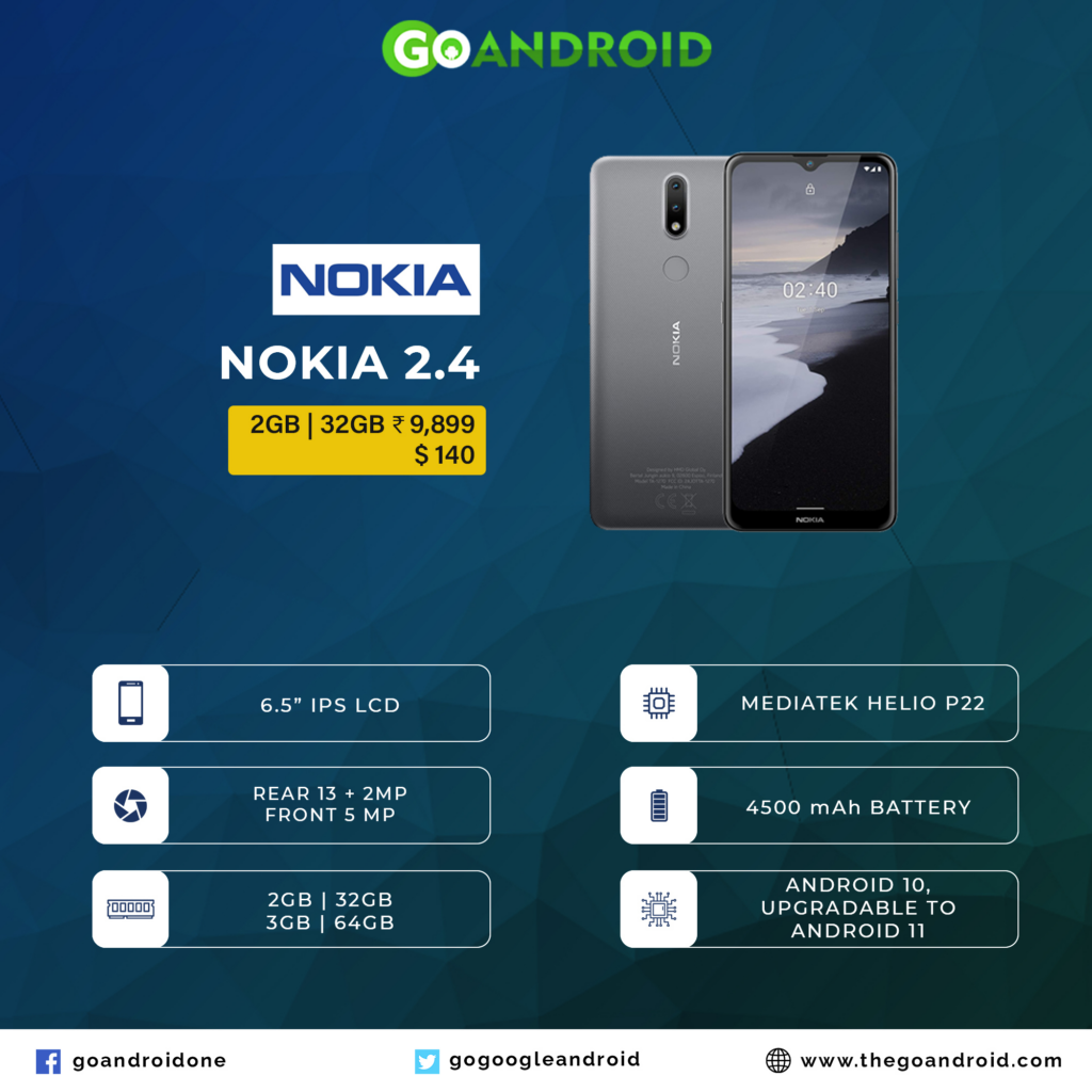
It seems like Nokia is still not done with the deployment of Android 11. In August, HMD Global released the operating system to Nokia 1.4. And now it's time for the Nokia 2.4. The smartphone was launched in Sept 2020 with Android 10. Now, it is receiving a new update that brings Android 11 besides the security enhancement.

Nokia 2.4

Make sure to visit: List of Nokia devices to get Android 12 update

The latest software for Nokia 2.4 can be identified by version number V2.270 that weighs around 484MB in size. Needless to say that the package will bring all the Android 11 goodies. Along with this, the update arrives with the current security maintenance by Google, November 2021 patch.

Though the official changelog does not mention any precise changes apart from better system stability and UI improvements. But it will obviously carry all the Android 11 additions. This includes chat bubbles, one-time permissions, smart device controls, native screen recorder, enahnced dark theme, concersation management, and much more.

Changelog


  • Better System Stability

  • User interface improvements

  • Google Security Patch 2021-11


If you own a Nokia 2.4, you can check if the update has reached your device. To do this go to Settings > System update > Check for update, and tap on Download and install. Also, the company recommends the user to keep your device connected to a Wi-Fi network to avoid carrier data charges.
Read more: [Update: November 2021 Security Patch] Nokia G50 Updates Tracker

Google Chat gets a new bottom bar UI on Android

Google is steadily changing the layout and design of its services and first-party apps. Be it dynamic Material You theme or some other visible changes, the company is making everything more convenient. In the latest news, Google Chat on Android is getting a new bottom bar UI.

Google Chat
Make sure to visit: How Google Robot Check For Lags In Android Devices? Here's The Answer

The old UI packed all shortcuts including Gallery, Camera, Drive, Google Meet, and Calendar inside one large text box underneath the text area. Whereas, the new UI brings a pill-shaped text box alongside a “+” button on the left. Tapping on this button will take you to other services like Google Photos or Camera. On the other hand, you can notice the gallery shortcut on the right corner opposite the send button. In a nutshell, the new bottom bar houses all shortcuts under a button.

[gallery link="none" columns="2" size="full" ids="121360,121359"]

The new Google Chat bottom bar UI is unfurling widely in a stable phase via version 2021.10.31.408397499. You can upgrade your current version from the Google Play Store. If the update isn't available for you now, you can tap on the button below to flash the APK file.

Download Google Chat from Play Store


Download Google Chat APK file


Read more: Google finally added dual SIM support on Android Auto